Project brief
We have been the client’s appointed design partner since January 2019. The product is well engineered and has a strong proposition for addressing various users’ needs, but without a UI and UX designer, the product was not as intuitive to use. The platform, which is in the form of a mobile app, needed to provide a user experience that was easy to understand, quick to adopt, and delightful to use. As a startup, it was important for the designs to help them stand out from their competition.

User Research

Our findings and our solution
New wireframes and user journey
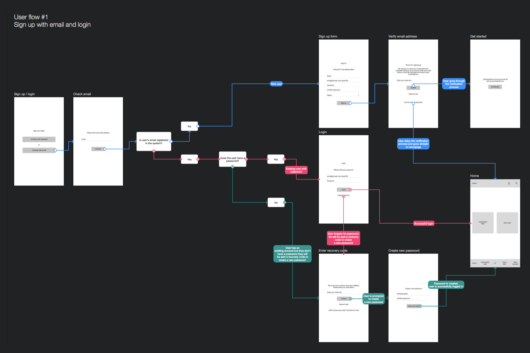
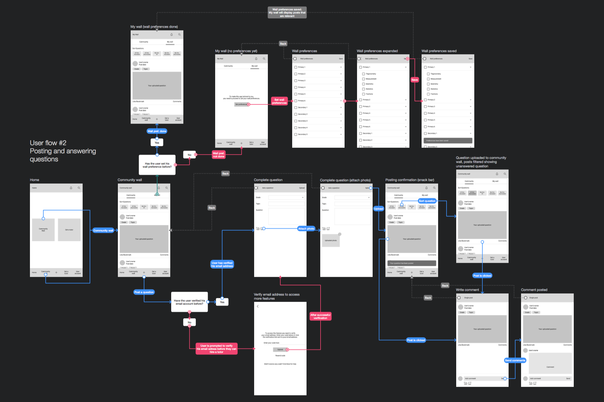
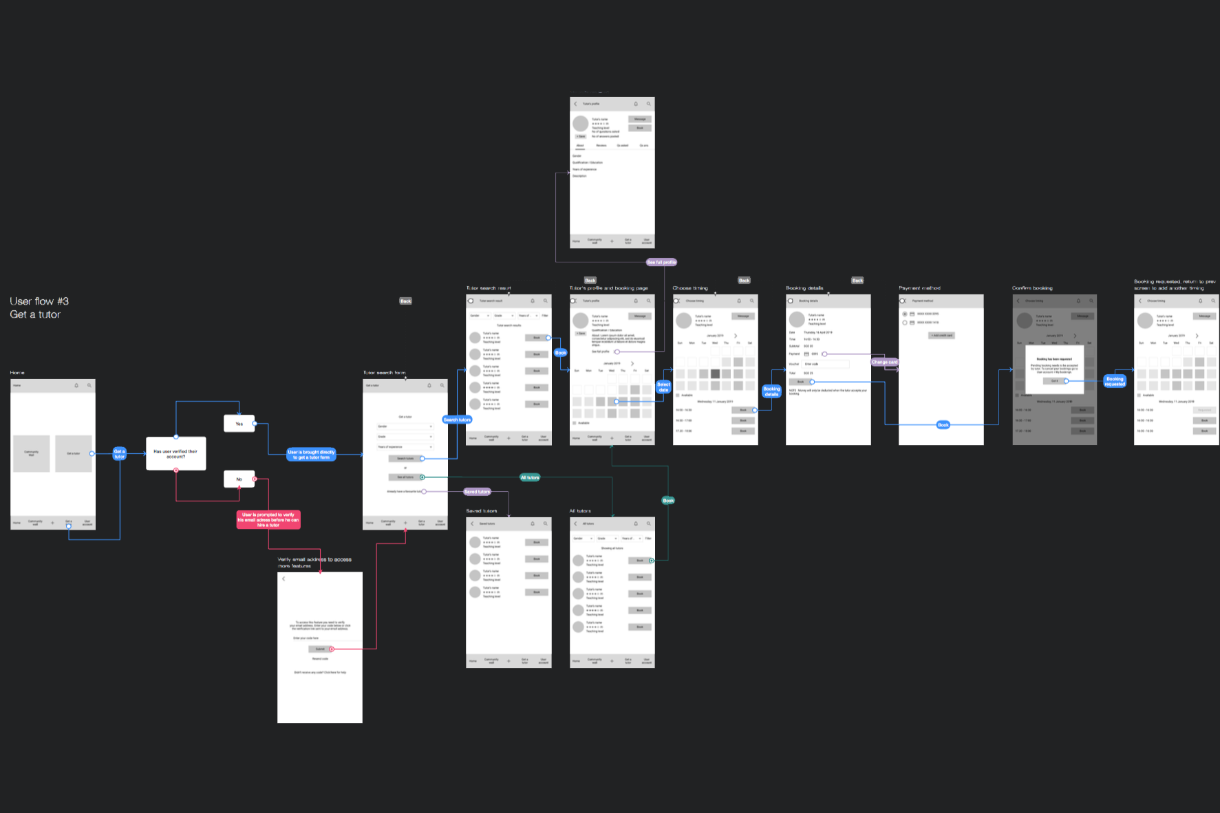
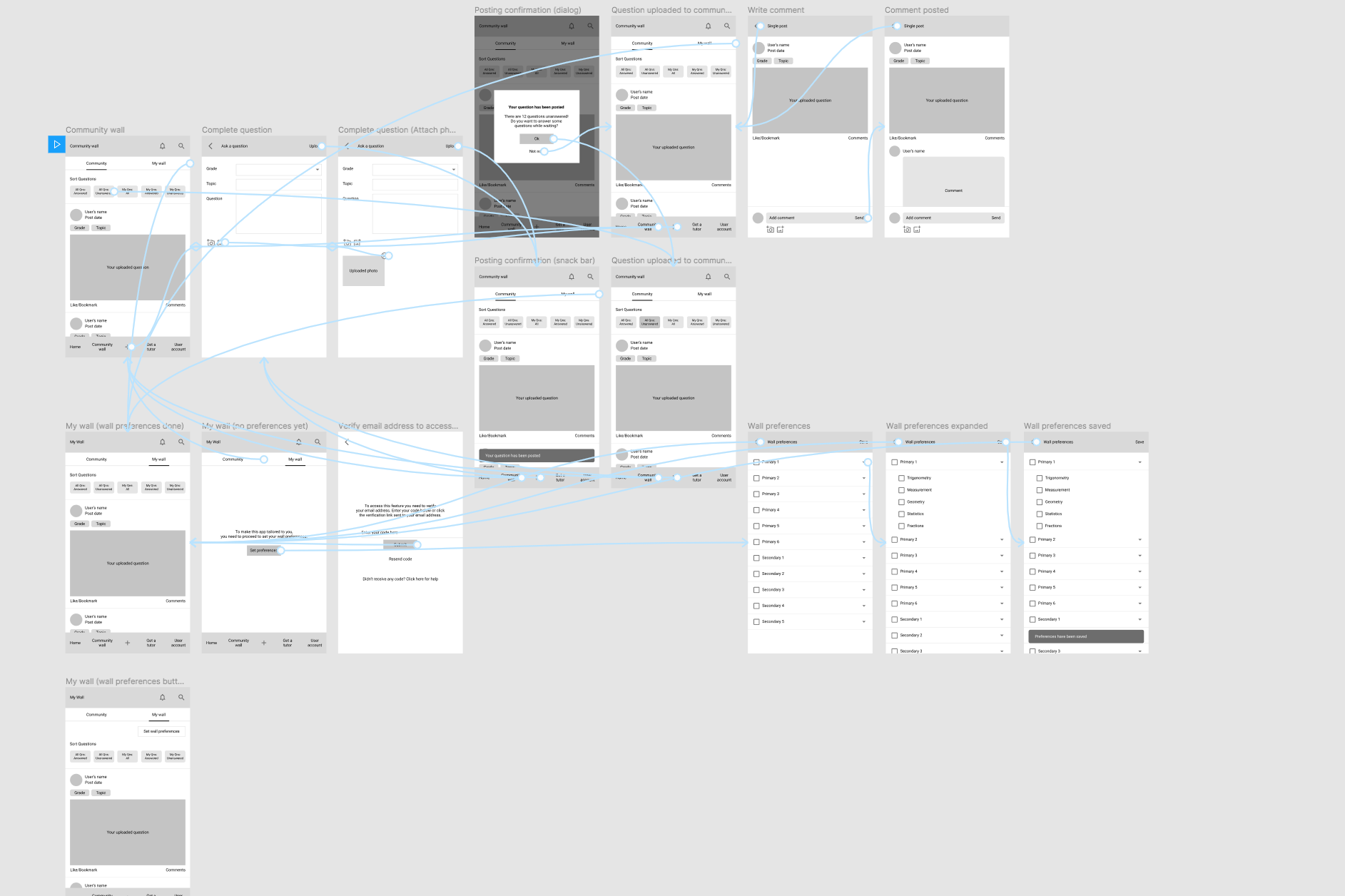
When we started our collaboration with the client, they already had a working product which their team of developers worked on. In order for us to deliver a suitable solution, we studied every possible user journey that existed so that we could establish an understanding of the backend technology first—what was already built and feasible, and what may need to be re-engineered. We went on to propose new wireframes and user flows for every feature, while keeping in mind, as much as possible, what we could keep so as not to spend time and resources redoing the whole product from scratch.
On boarding the clients
User interface design
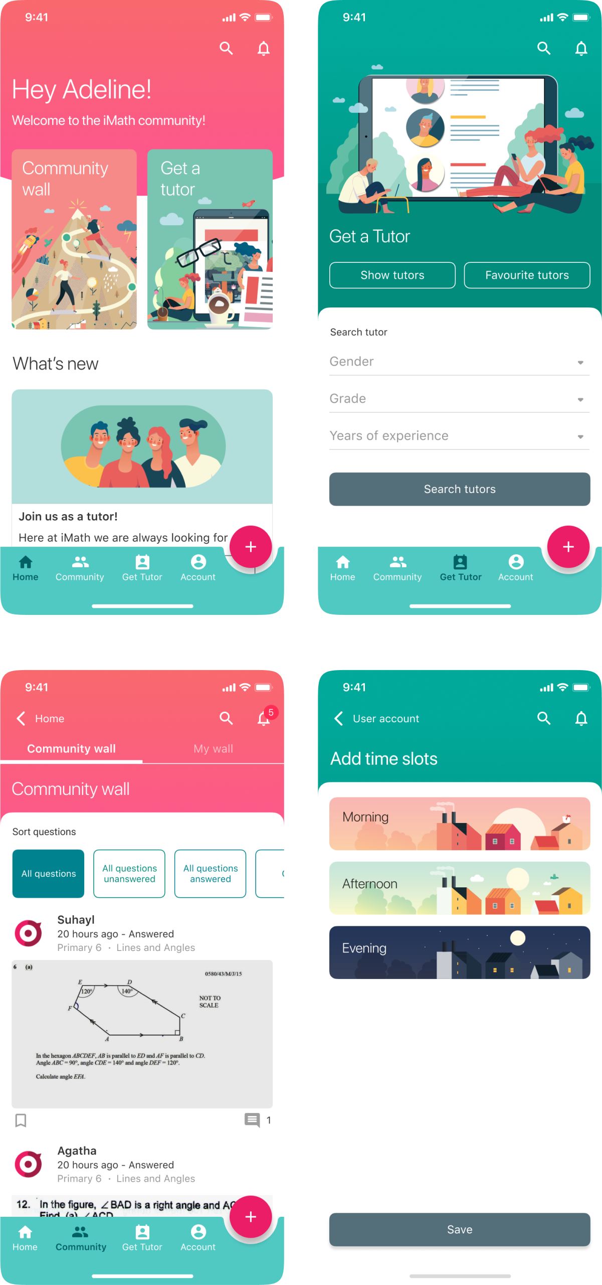
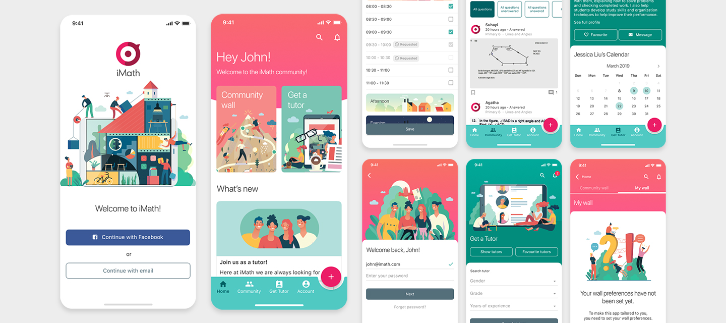
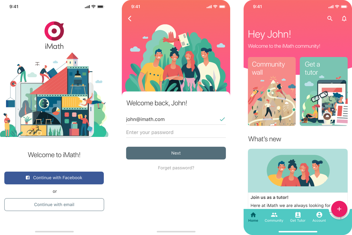
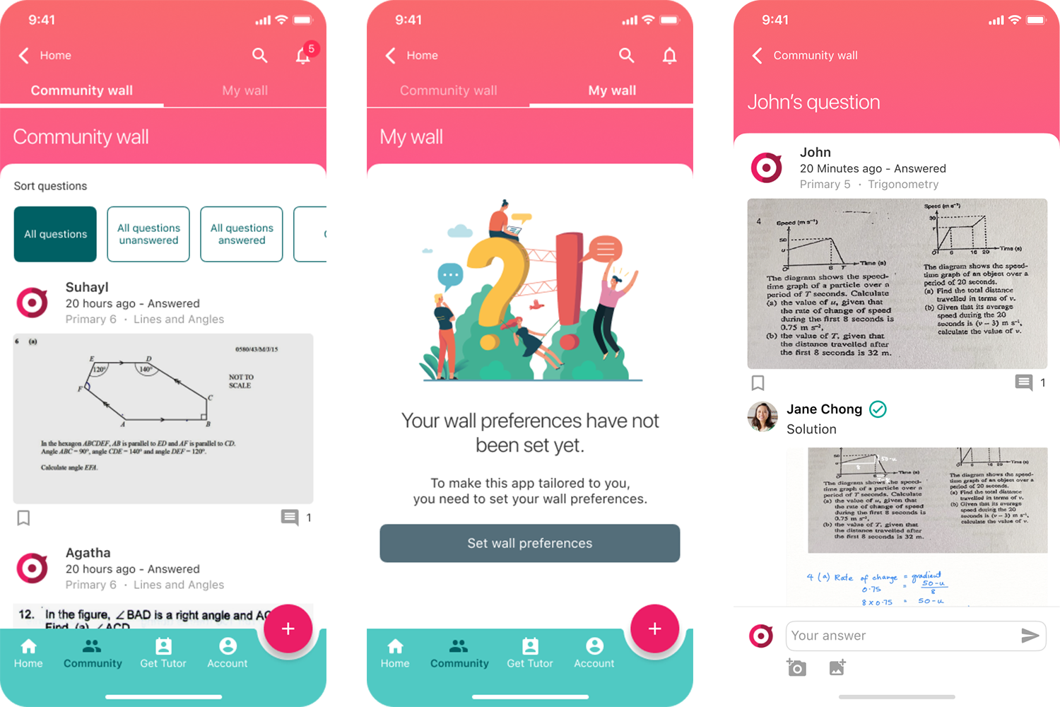
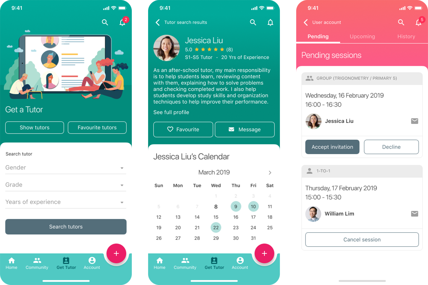
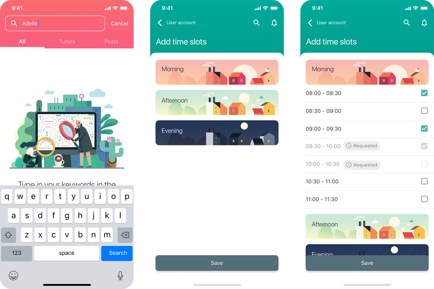
Math and tuition is often associated with negative emotions for both the parents and the child. For parents, it can be a form of anxiety to know that your child needs additional help with a subject as they worry about their child's school grades. For the child, well, they would very much prefer to play and have time to relax then go for another class. We wanted their experience with iMath to be a cheerful and positive one. Thus, we adopted colours that were bright, bold and contrasting to bring out energetic and liveliness vibes. Illustrations were carefully chosen to ensure the style and the content are consistent with the narrative that learning math is fun and creative.
