Project brief
Nine Tales is a Singapore-based startup focusing on children’s storytelling, with a goal of helping children build emotional intelligence through stories. As a new company, 55 Minutes was tasked to design a website for Nine Tales to build awareness for the company and mobile app.
Our approach
Design
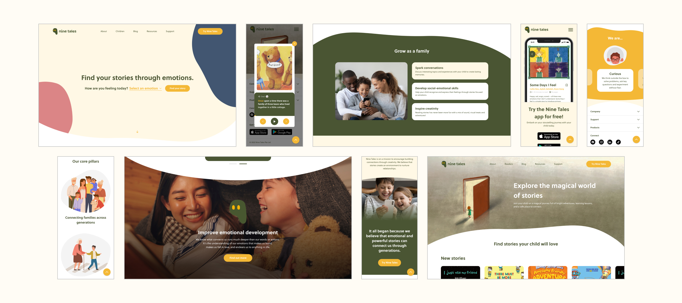
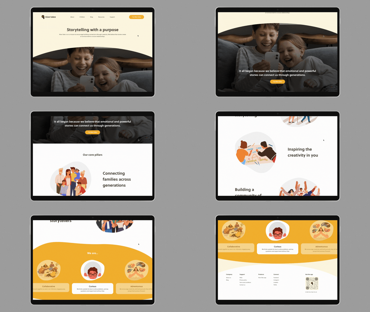
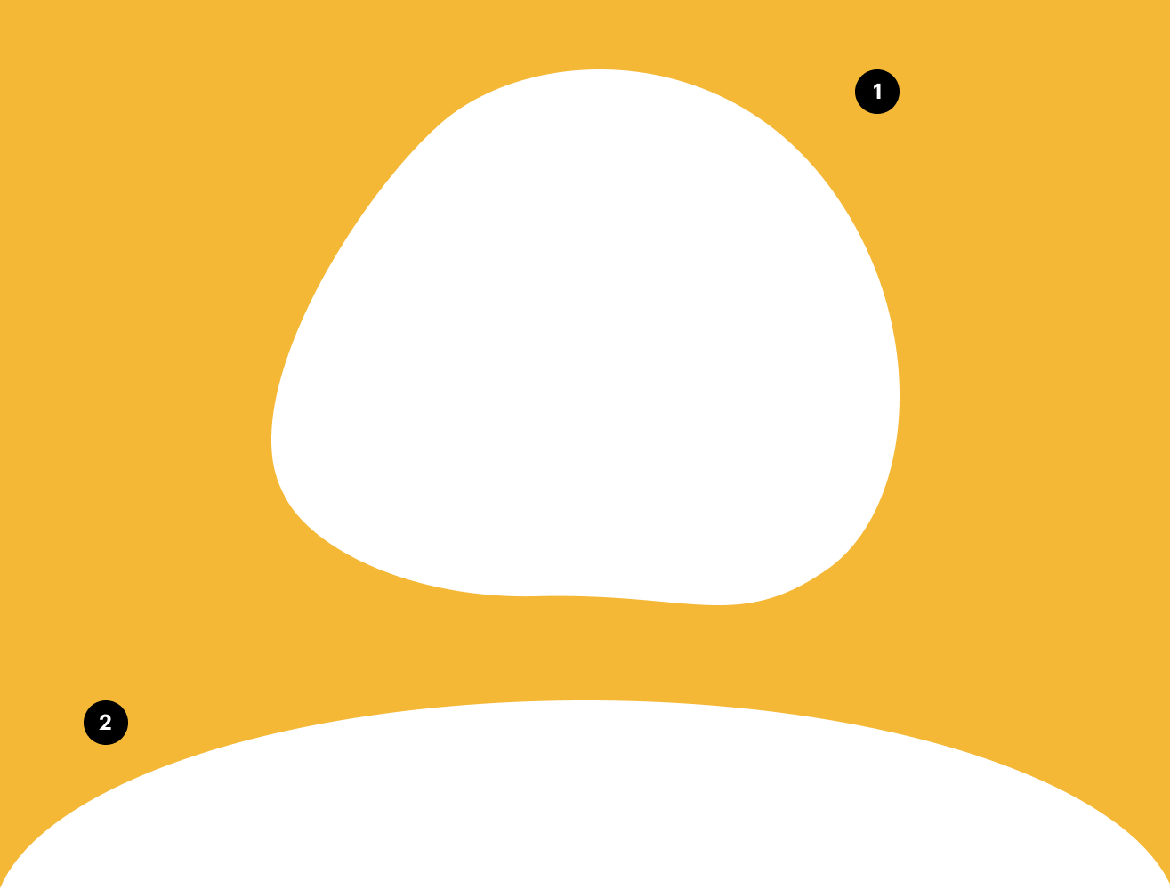
Tying back to the importance of building emotional intelligence through stories, we wanted the website to look organic and raw, much like how emotions are in general. Taking on the same organic blob shape of the logo, we tweaked it to differentiate it as individual sections of the layout on the website.
We designed two blobs, both of which were used throughout the entire site. They were then used individually or mixed together to differentiate each section of the website. This was done by rotating them or mixing them up together, or with a rectangle shape.
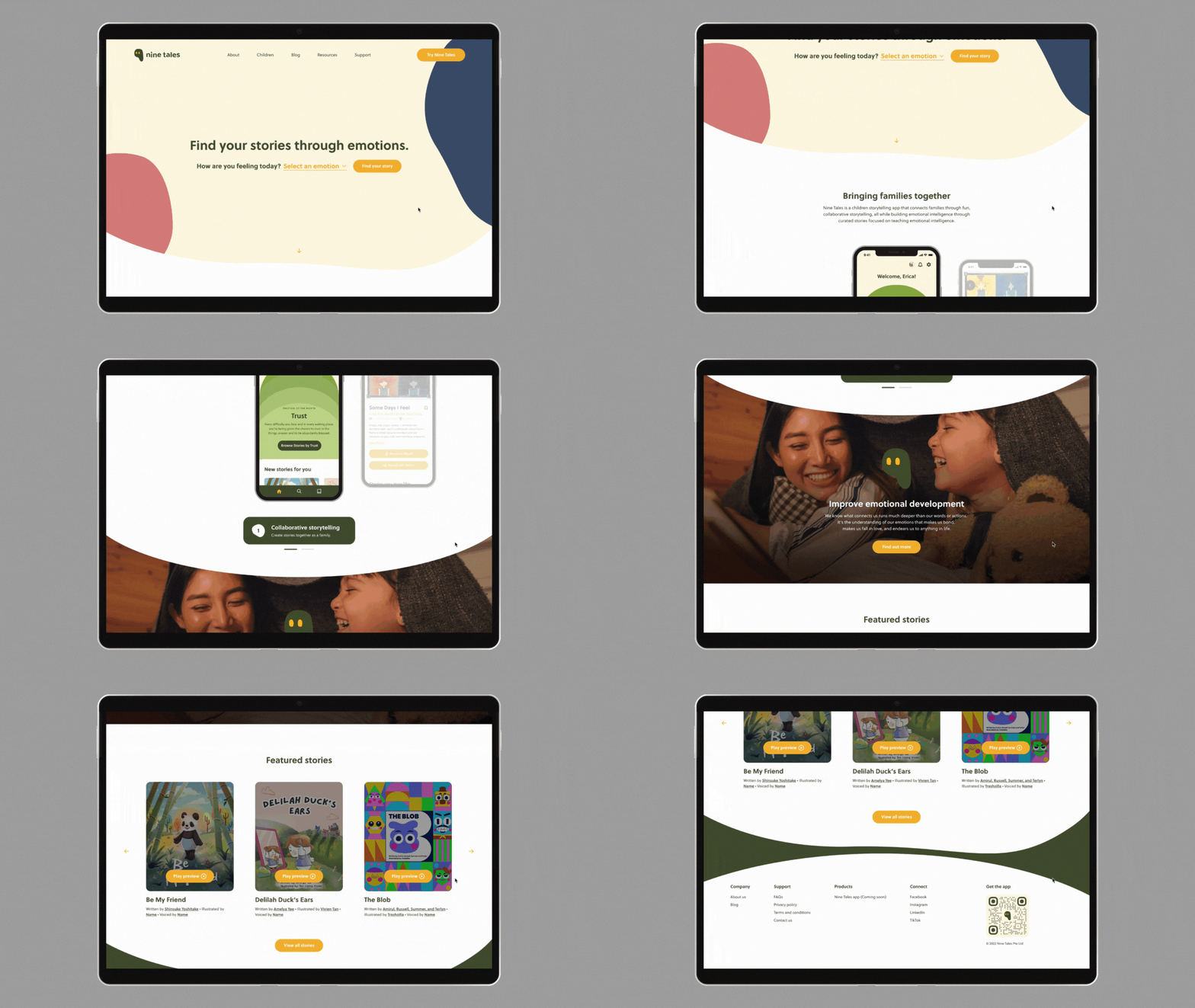
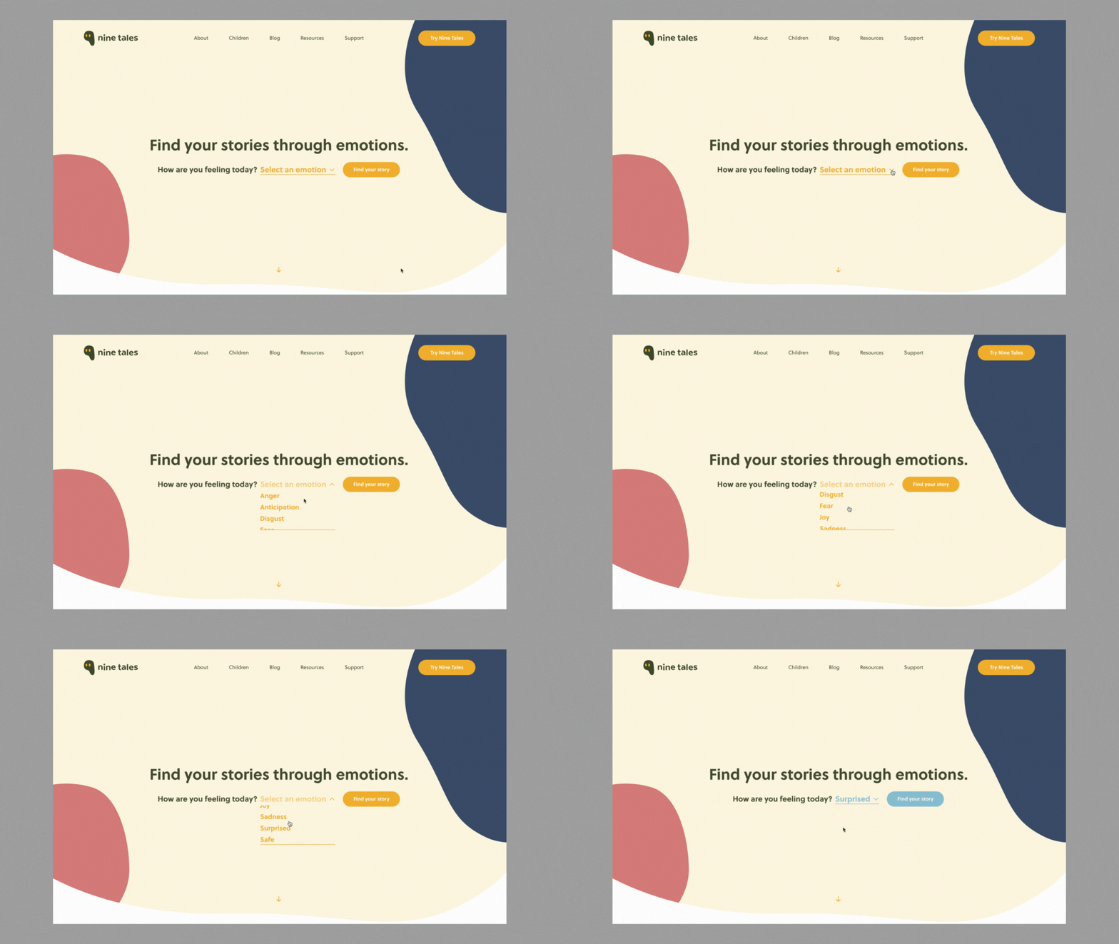
With emotions playing such a vital role in Nine Tales, we designed the main banner on the homepage to reflect that by having users select how they are feeling from a dropdown menu. This would then bring them to another page consisting of a list of stories to browse through based on the selected emotion.
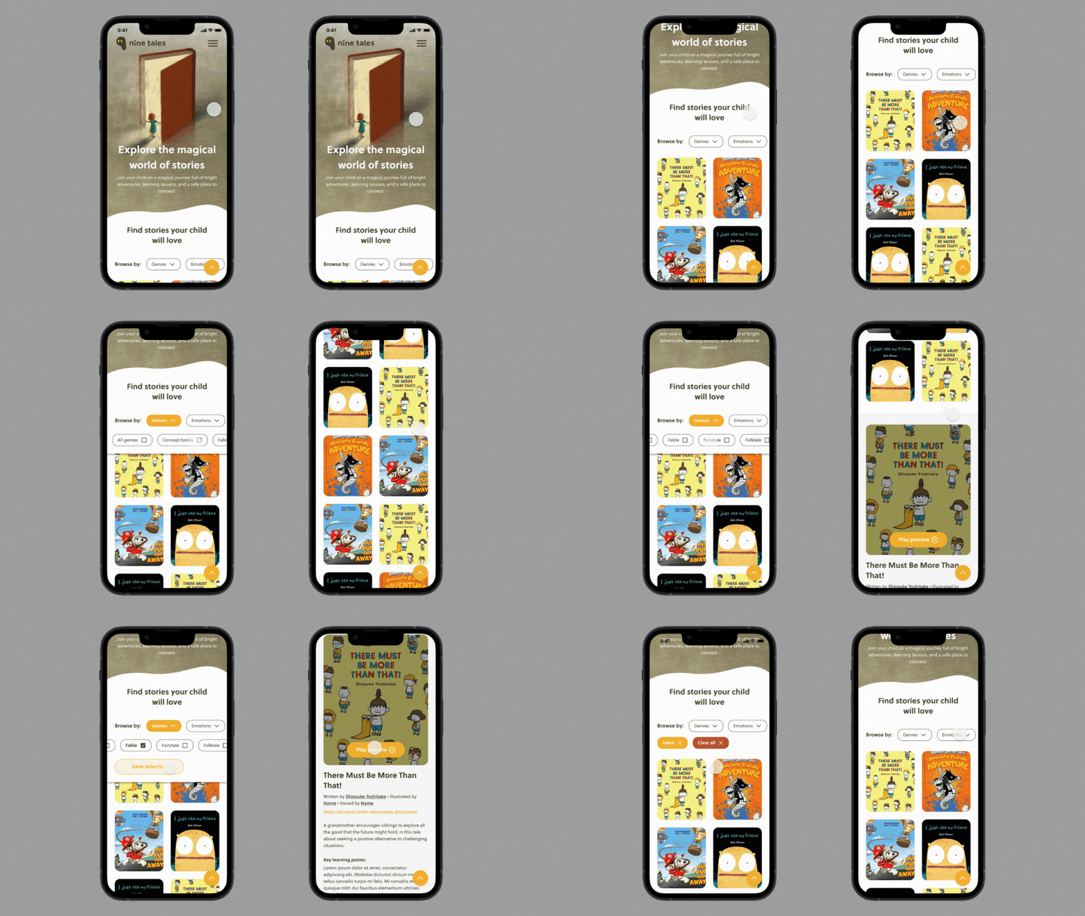
Users can browse stories by scrolling down the page, or by utilising the filter function to filter by genres, emotions, or themes. After selecting a story, users are also able to preview and listen to the first five pages of a story. This helps parents get a glimpse of each story on the content, imagery, and how the voice artist sounds, which builds trust between parents and Nine Tales.
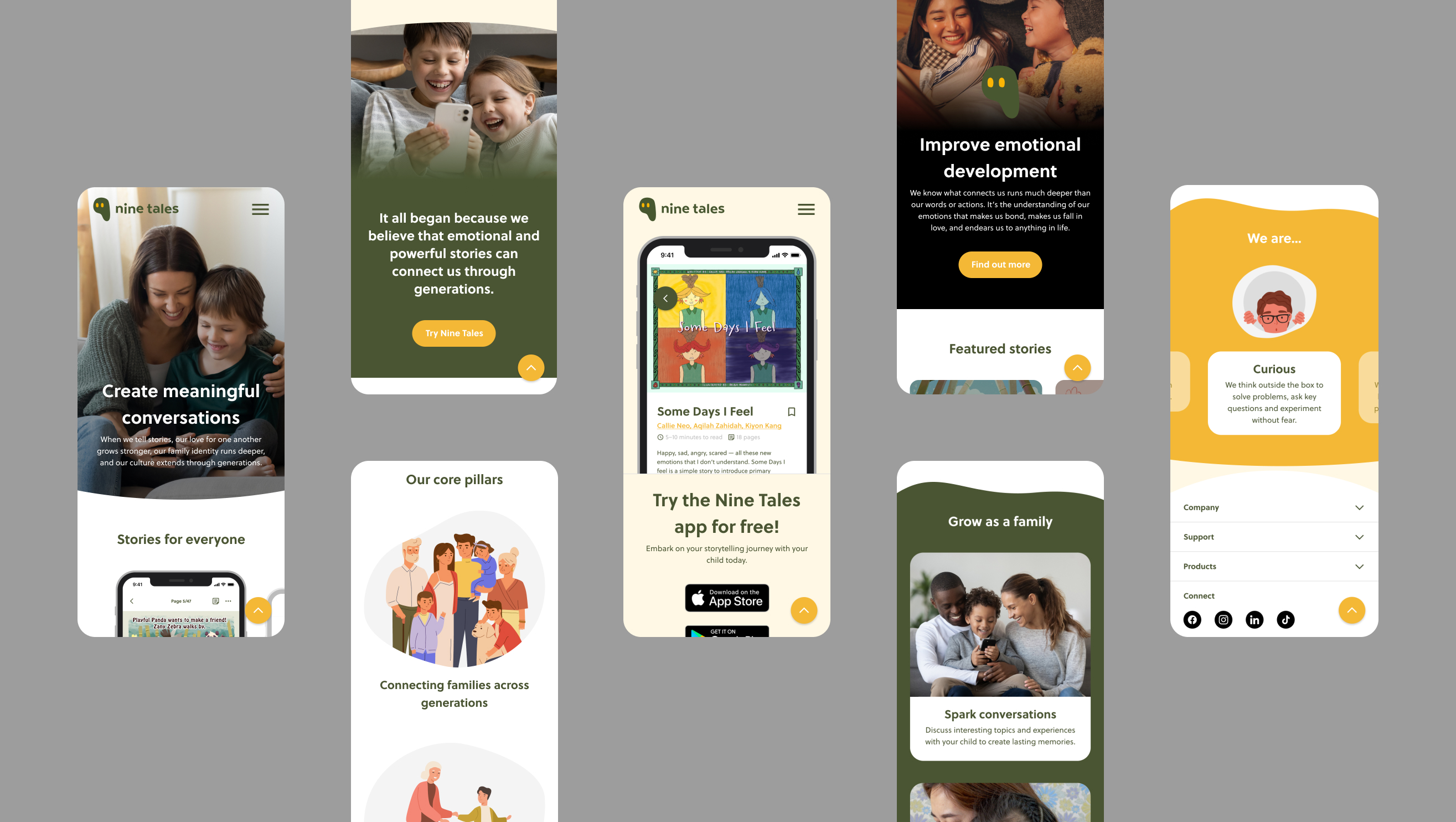
With storytelling as Nine Tales’s focus, the website was also built so that each section would take up half the screen size or more, enlarging images and story covers to frame them as the heart of Nine Tales.
Imagery
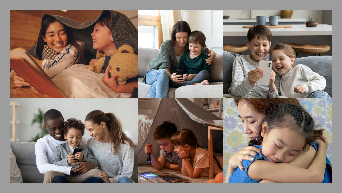
As much as Nine Tales is a children’s storytelling company, we did not want the focus to be on stories. We wanted to communicate one of Nine Tales’s core pillars — building connections and connecting families through storytelling. Emotions are powerful forces, and we wanted to portray that as much as we can on the website. Hence we settled on photography as the direction and the medium of website imagery, emphasising on humans and connections.
