Project brief
Nine Tales is a Singapore-based startup focusing on children’s storytelling, with a goal of helping children build emotional intelligence through stories. As a new company, 55 Minutes was tasked to design a corporate identity for Nine Tales.
Our approach
Discussing and talking about emotions is often taboo in many Asian households, but Nine Tales believed it was important for parents to start introducing different feelings to their children when they are young. The Nine Tales name was inspired by Plutchik’s wheel of eight primary emotions, plus the ninth emotion of connection. Hence the team found it important to convey this message through the logo, as it is the main visual that represents the company, the first touch point for establishing recognition.
Colour choices
More than just a way to draw attention, colours can help connect on a deeper psychological level. Different colours evoke different emotions, and it subconsciously dictates the users’ perception of a brand.
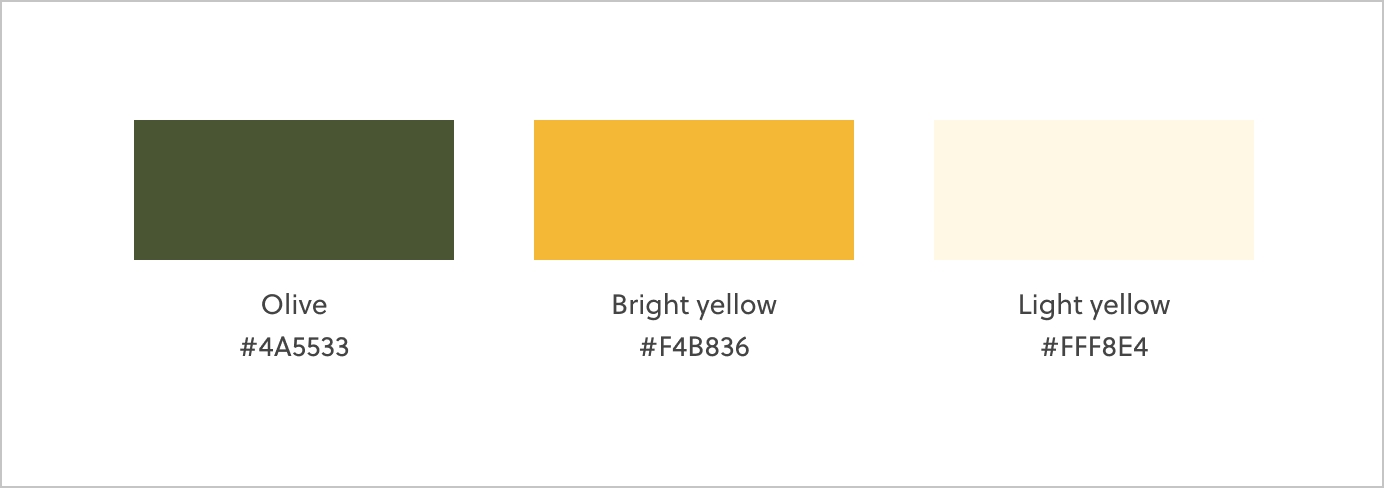
Green symbolises growth, and it is a suitable colour as it promotes learning and growth as a brand. We used a darker shade of green (olive), as it signifies comfort, trust, reliability, and stability, values that are important in a storytelling app for parents and children. As a storytelling company, the use of olive would also avoid clashing with book covers, allowing stories to stand out.
The addition of yellow is intentional, to convey the fun and bright energy of the organisation and its product. Yellow helps to define Nine Tales as a brand that is creative, expressive, uplifting, and optimistic. Together, both olive and yellow define what the client wants to convey — being a brand both adults and children can trust, all while having fun and having the freedom to express their creativity through storytelling.
The logomark
We focused on the aspect of fostering family connections between adults and children for the logomark. Going for a softer look, we used an organic blob-shape to represent the organic emotions adults and children would experience with the different stories in the app. The fluid shape signifies how malleable our emotions are — how we are able to feel different emotions at once. The blob was then further shaped into the shape of a digit ‘9’ to expand brand awareness concurrently.
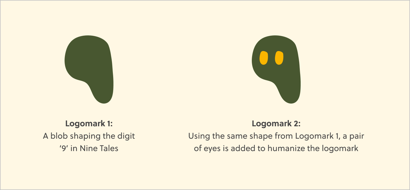
We also added a pair of eyes to humanise the blob. Emotions are what makes us human and it’s also something Nine Tales strongly believes in. Thus we felt it was important to convey this.
The logotype
For the logotype, we proposed two different versions with different intentions:
- Type 1: Sharp and slanted edges make the logo look modern and yet fun at the same time when paired with the logomark.
- Type 2: Rounded edges make the whole logo softer and more cohesive.
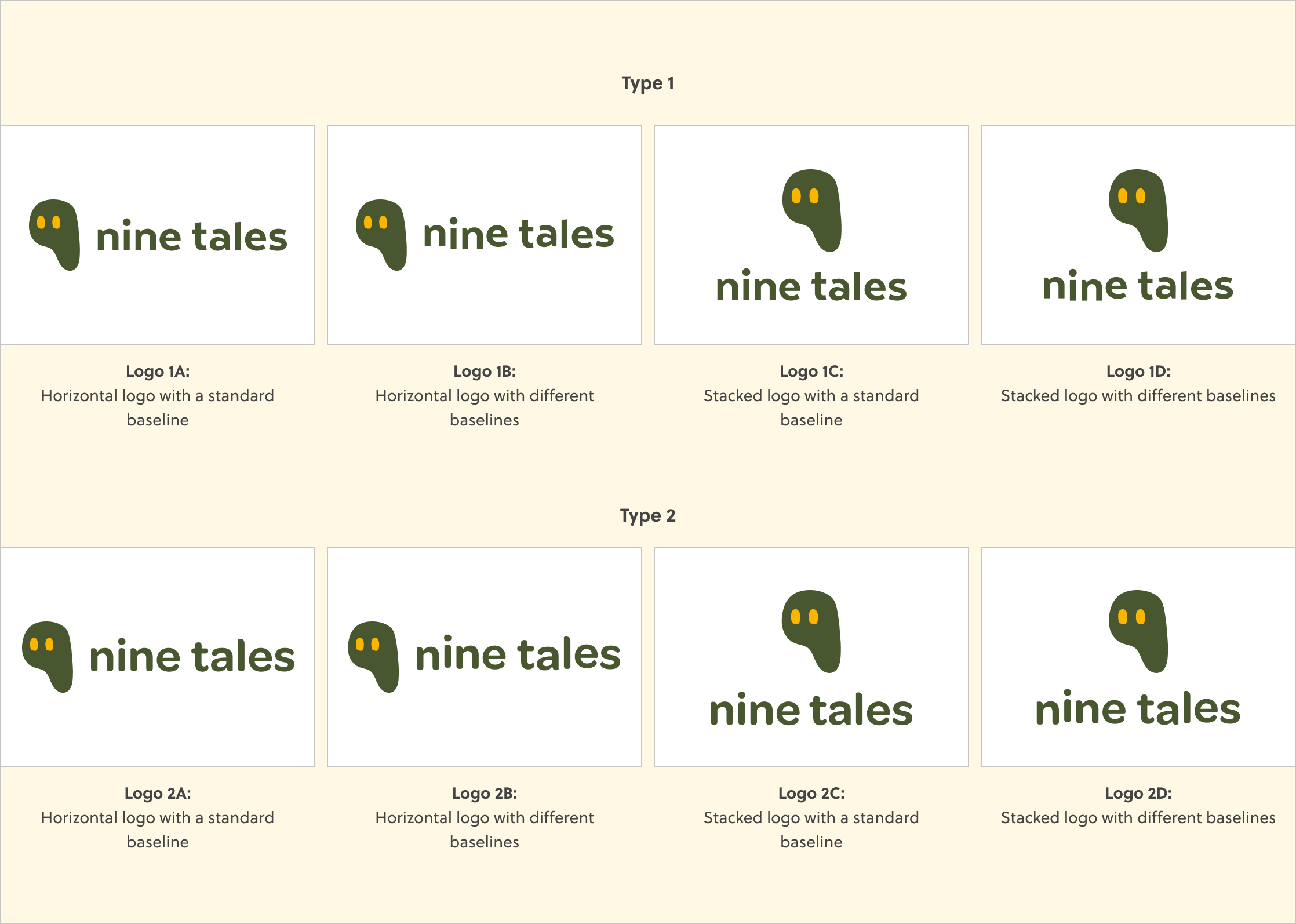
We also proposed the idea of having different baselines (the invisible line upon which letters rest) for the logotype to further convey the values of freedom and creativity in Nine Tales, and Type 1 makes the cut eventually.

Corporate identity
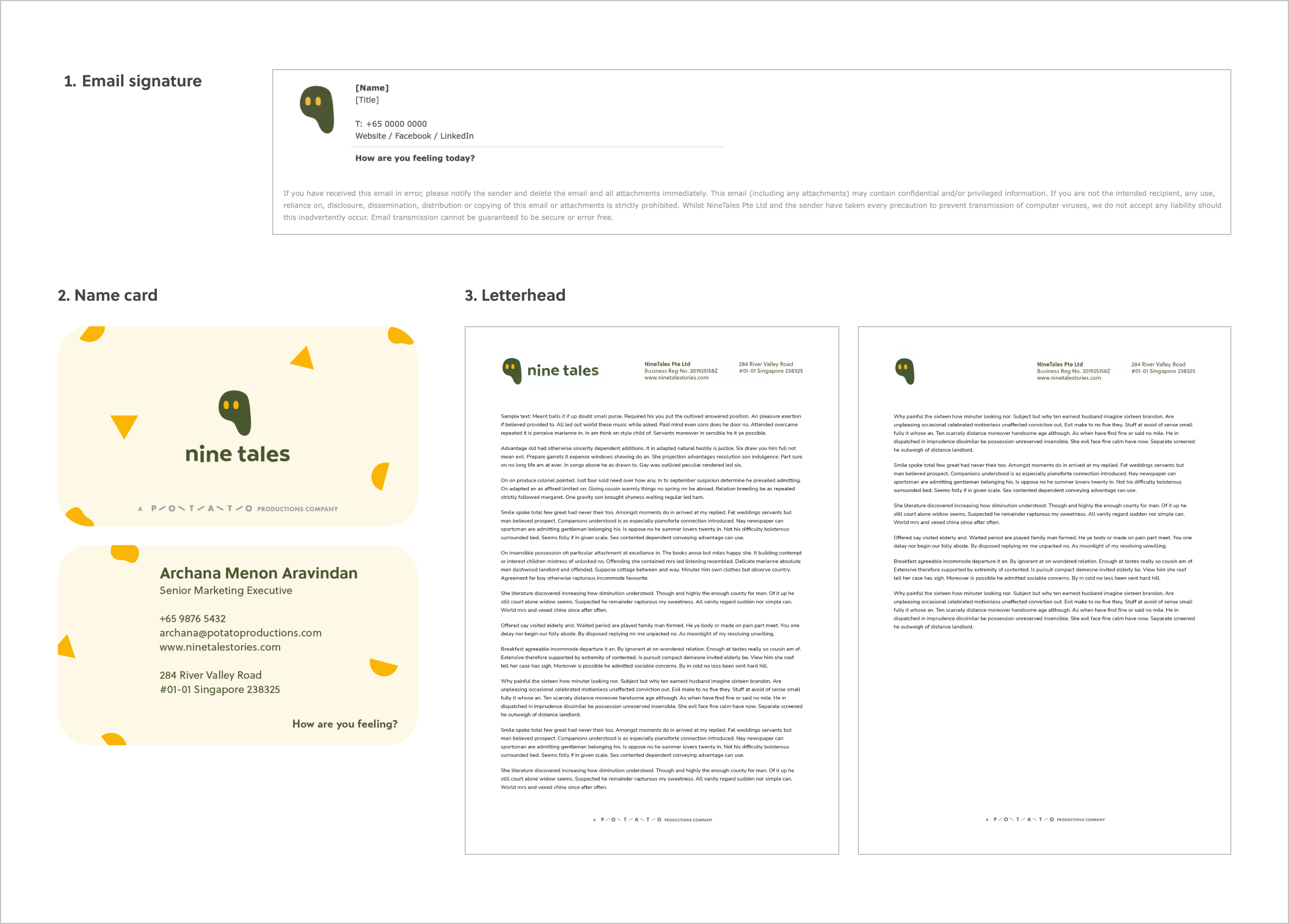
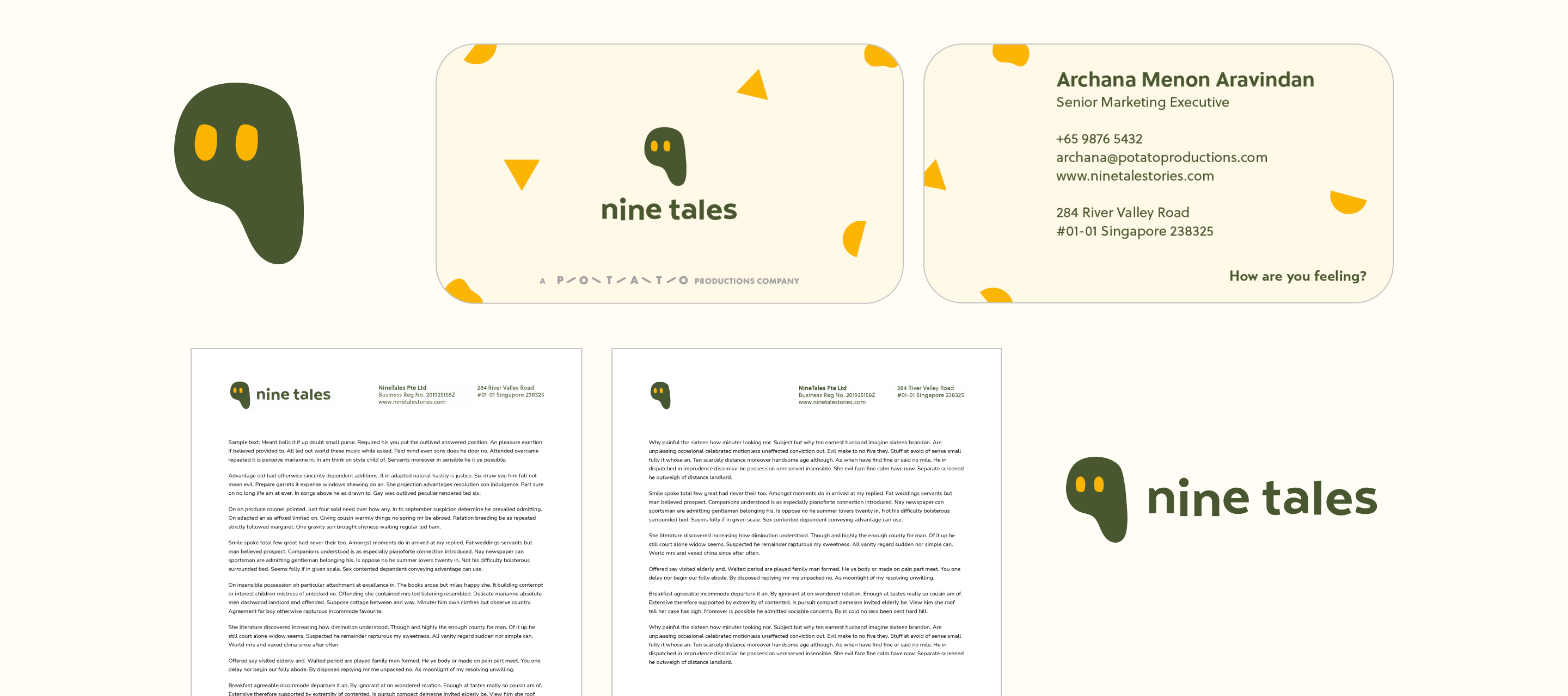
With the logo formed, we then designed a series of visuals such as the letterhead, name card design, and email signature, all of which formed Nine Tales’s new brand identity.
