Project brief
When the founders started the company in 2019, their goal was to look into ranking for universities to help students pick their best classes. The initial intention for their brand identity was thus youthful. But as their business model evolved, the target audience shifted from the students to universities. They now provide data and insights to universities instead, to help them make more informed hiring decisions for academic staff. This change meant they needed a refreshed identity to better communicate the work they do.
Our approach
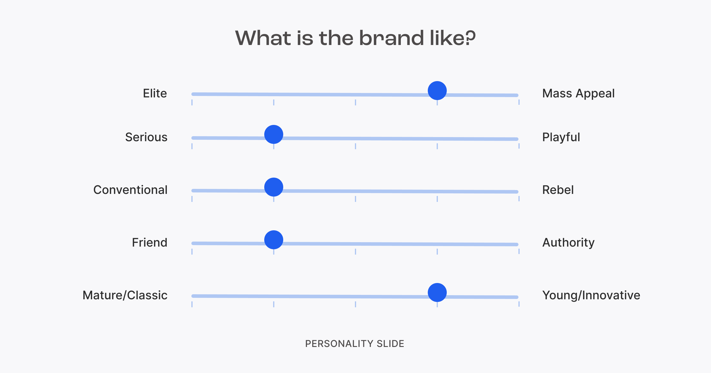
Before doing any ideation or design work, we conducted secondary research to analyse the competitor landscape in the EdTech sectors to identify key differentiators for the brand. From there, we kicked off the ideation process by defining core brand values and a set of guiding principles to shape the foundation of the visual identity.
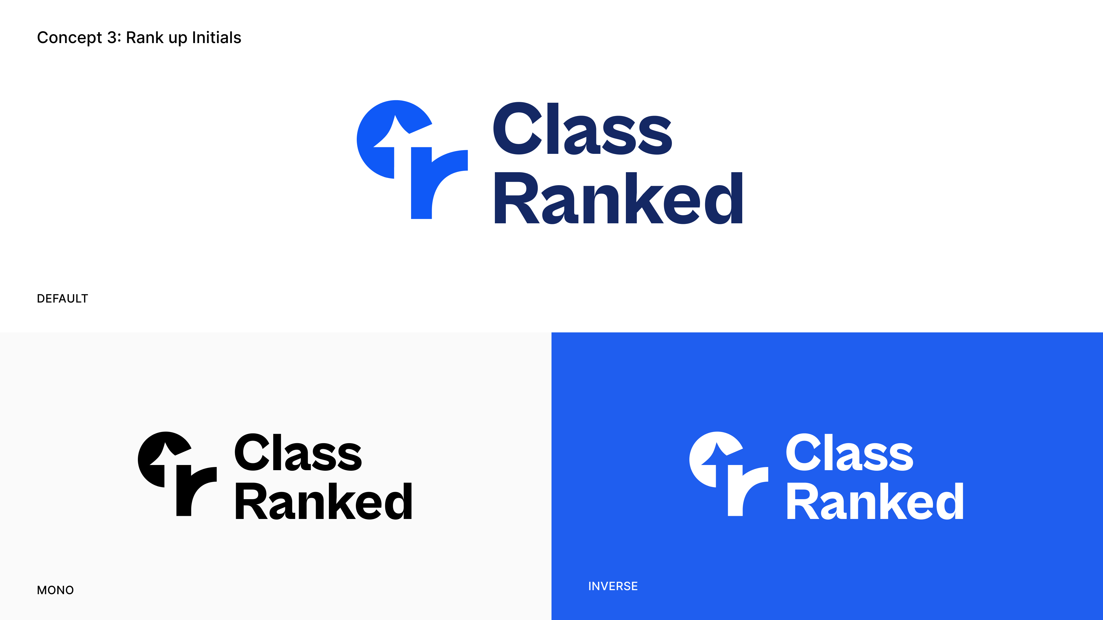
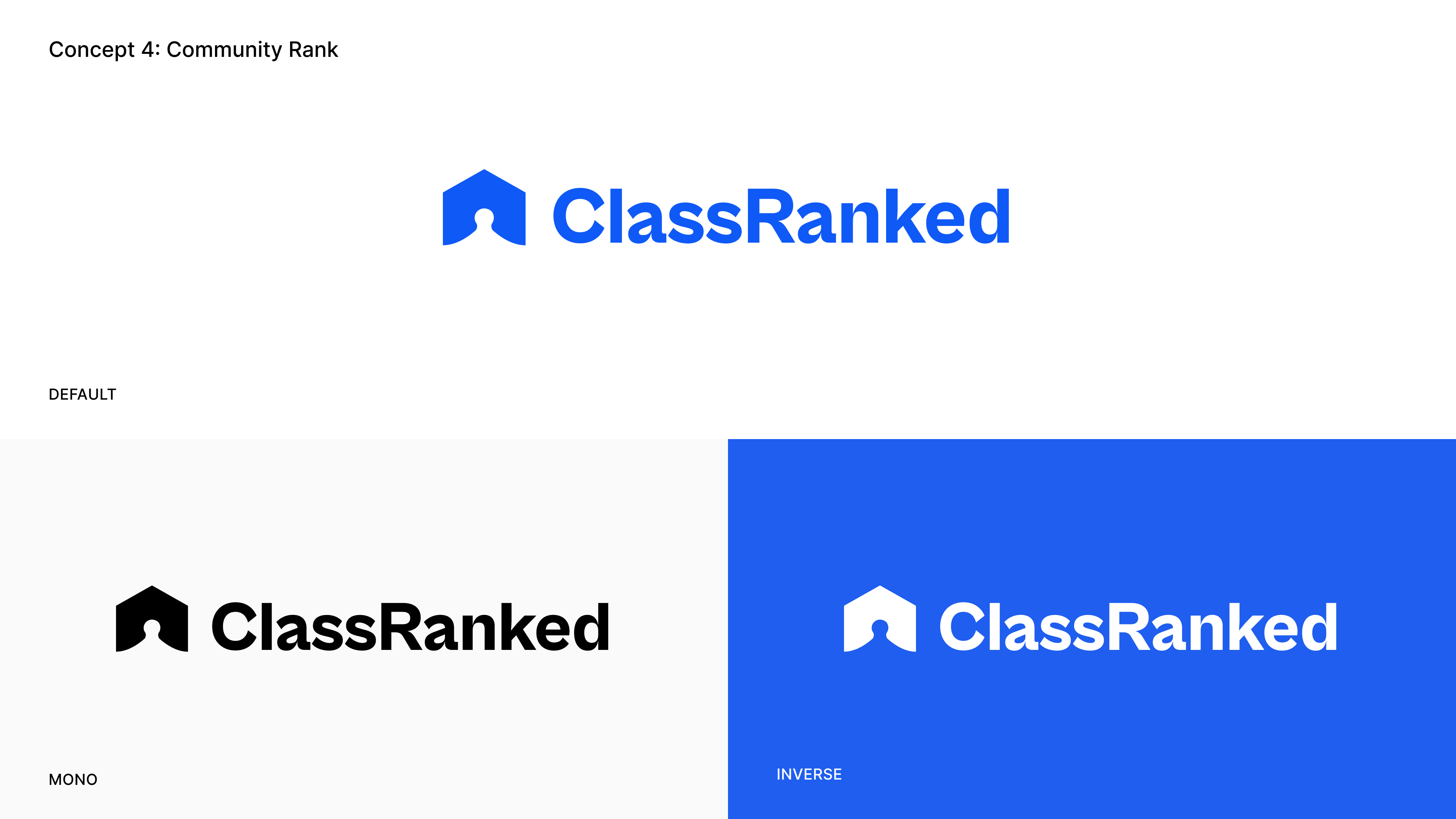
Exploring different design sketches of a logo is an important part of the branding process. This allows the design team to consider a range of different options and to identify the best solution that meets the brand's objectives and appeals to its target audience.
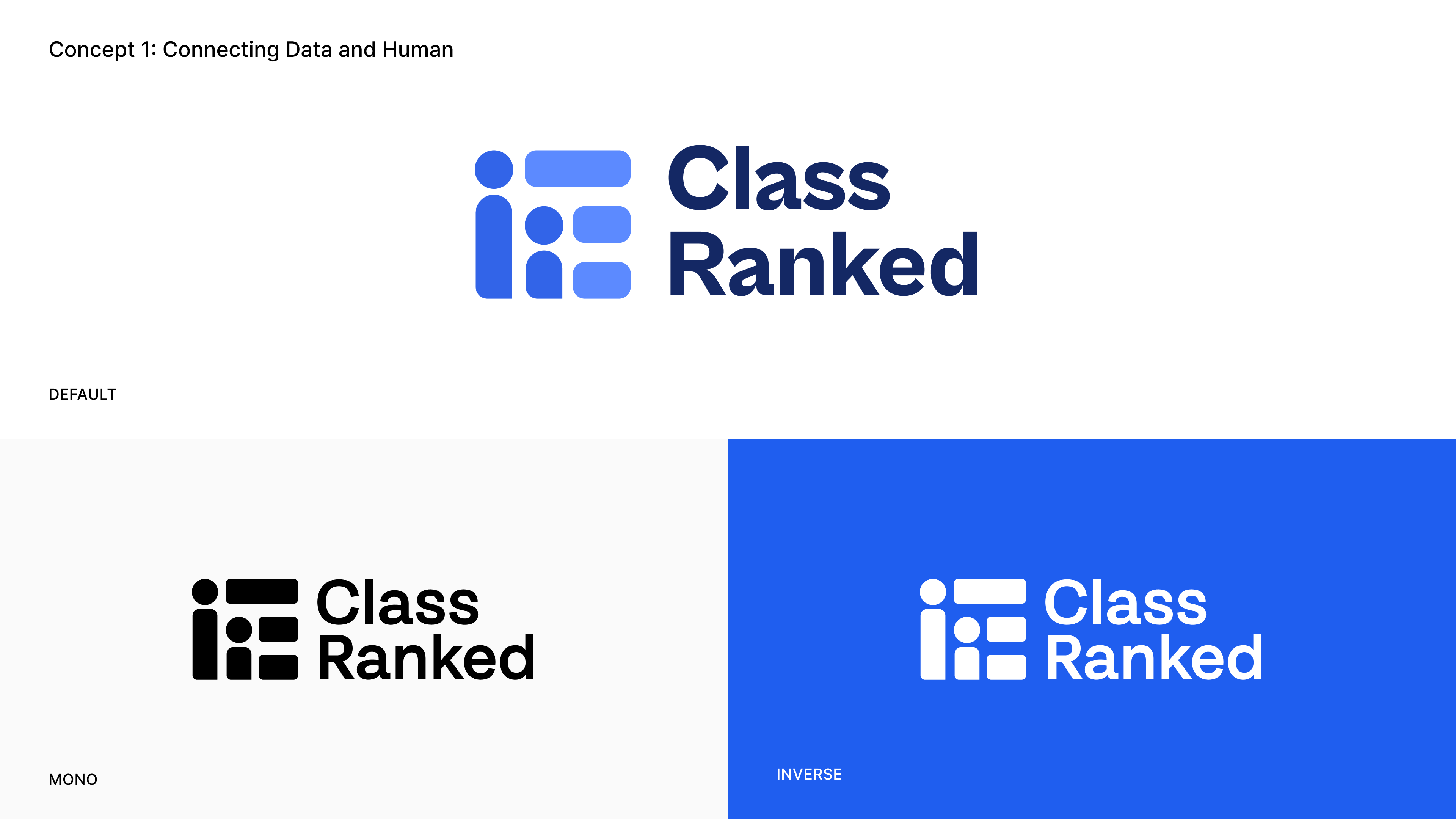
The client picked concept 1 because it closely aligns with the brand’s intent to be perceived as an innovative, technology-driven and people-first company. This design expresses the idea of offering solutions to enable data-informed decisions. The idea of ranking and data bits are represented through stacked dash like patterns that run across the logo. The integration of figurines also suggests that humans are an integral part of the product’s mission and vision.
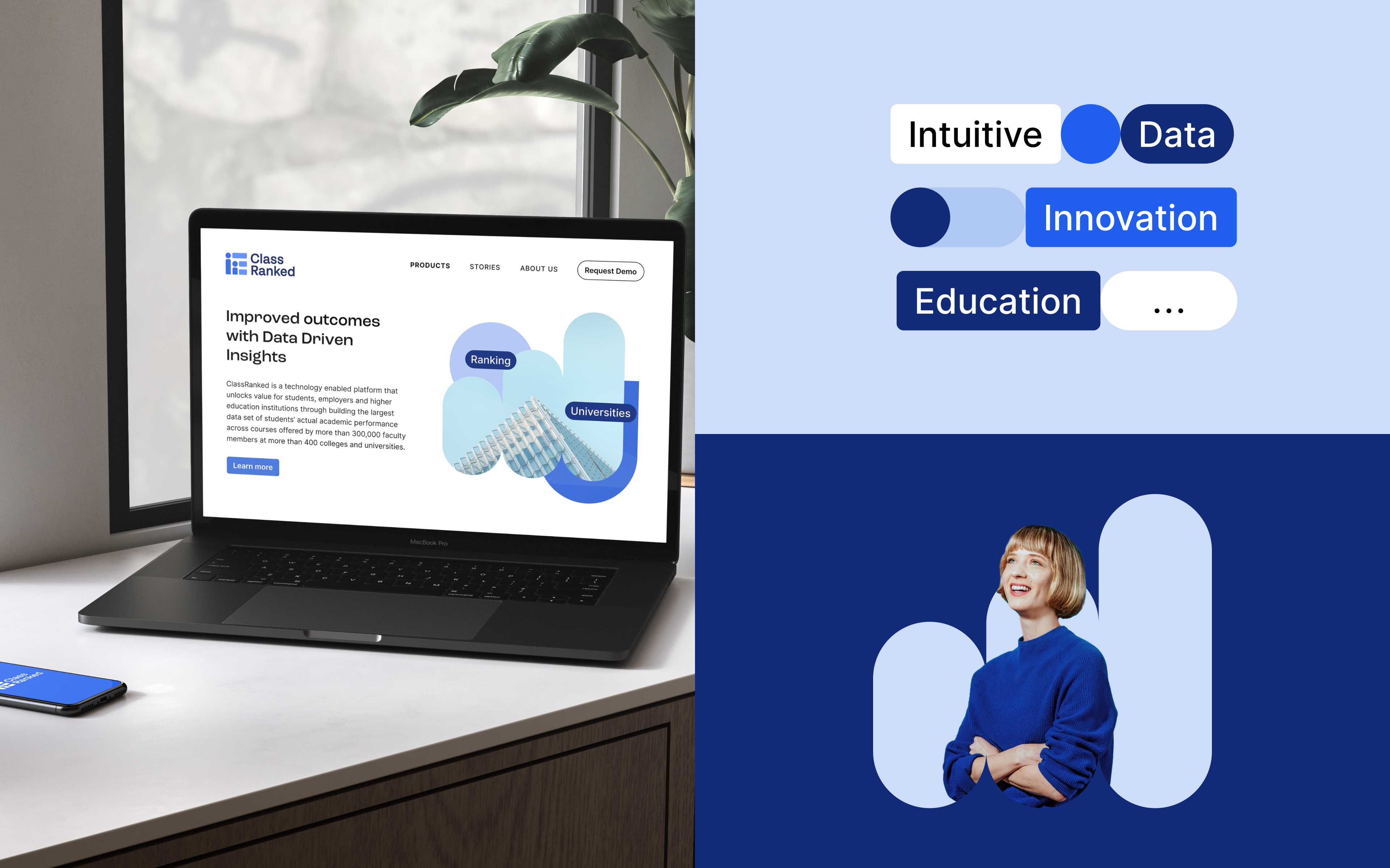
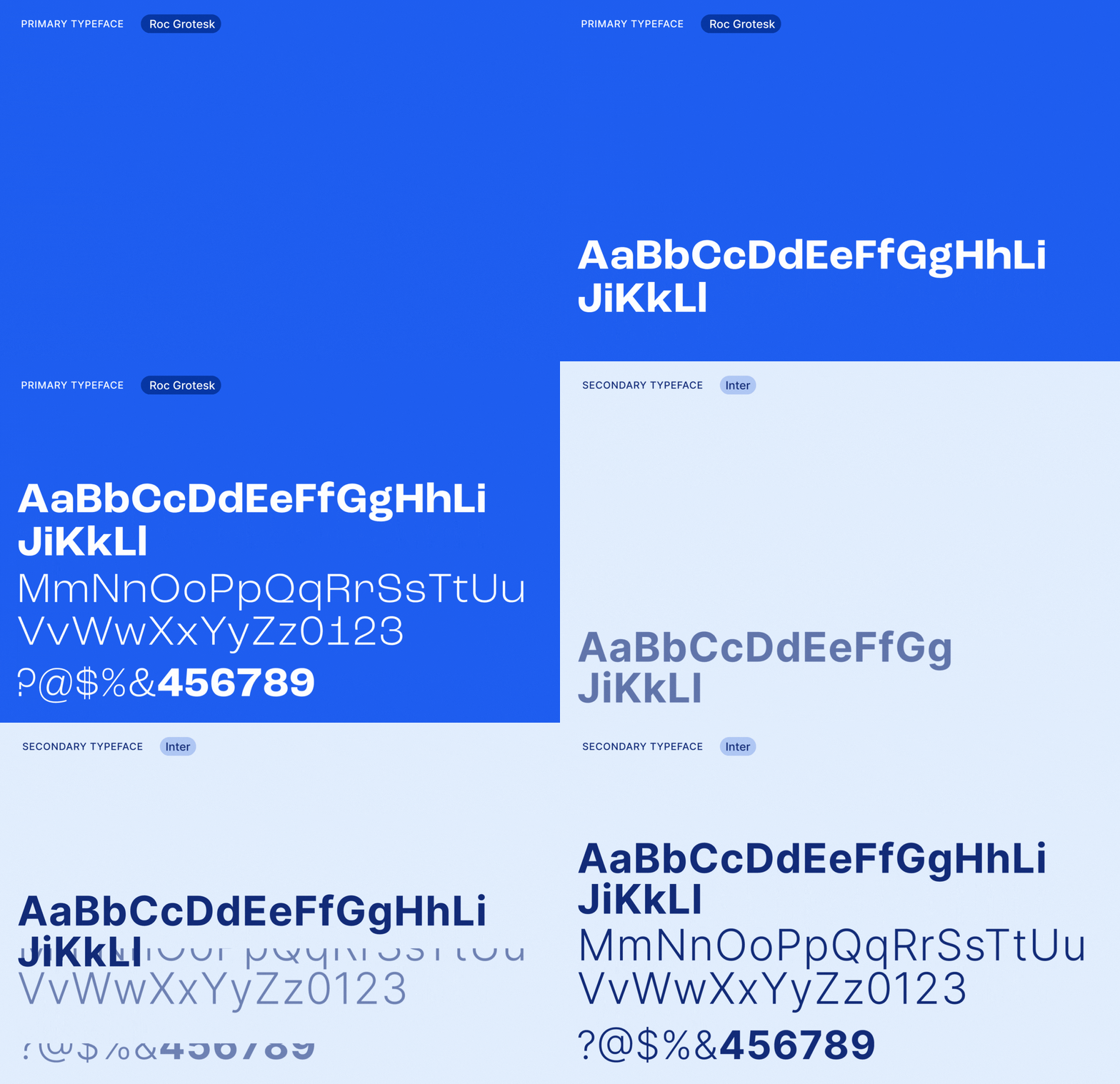
Aside from the logo mark, we also established a brand system for ClassRanked – defining a range of colour and type systems that complement the new logo mark. Having a well-defined brand system makes it easier for a brand to maintain its visual identity across different applications and channels. Additionally, when a brand consistently presents itself in a professional and cohesive manner, it creates a sense of reliability and credibility for the intended target audience.

In addition to the brand kit, the client also reached out to us to animate the logo. The goal was to create a visual effect that reinforces the brand's visual identity and make it more memorable to viewers. The narrative behind the logo is based on the idea of processing through strings of data to deliver the most optimal data-informed decisions/results for the consumers. The team experimented with different movements and keyframes to produce a simple yet dynamic logo animation.
The result
Overall, the client was pleased with our renewed interpretation of ClassRanked – one that aligns with the new direction of the brand. It was also an exciting opportunity for 55 Minutes to work and collaborate with international clients – extending our reach to global markets.
