Project Brief
We were brought over by SmartJen to redesign their student platform to better engage students in their learning process and to improve the usability and intuitiveness of the tutor platform. In their long-term business goal, SmartJen envisions their user group will range from primary students to secondary level students and hopes to approach more tuition centres across Southeast Asia. With their design needs and business goals in mind, we planned an extensive project plan to conduct user research as well as to design a suitable user flow for better experiences.
User Research (5 weeks)
- Redesign the student platform: how to better engage students in the learning process and be more motivated to learn?
- Improve tutor platform: how to better support tutors’ needs to achieve their tutoring goal seamlessly while using the SmartJen tutor platform?
- 1-2 weeks: Designing research methods and recruiting participants
- 2 weeks: Conducting interviews
- 1 week: Synthesising the outcomes and sharing insights and recommendations
I. Research methods for student platform
We recruited five students from the upper primary and low secondary school levels. Additionally, we talked to three tutors to hear their experiences and perspectives on students today. We used three main research methods, chosen for being concise, less open-ended, and well-visualised, to tackle our research questions: 1) Digital card sorting, 2) Comparison study, and 3) Semi-structured interviews with tutors


II. Research methods for tutor platform
We recruited five tutors who currently use the tutor platform and conducted a remote user feedback session where we asked SmartJen tutors to share their screens and perform usual tasks while using the SmartJen tutor platform in their context. After observation, we asked follow-up questions to understand what they hope to change in the current user flow to achieve their tutoring goals seamlessly.

III. Key insights and findings
For the student platform:
Most student participants are attracted by interactive elements such as sounds and bright visuals.
Many students require gamification and rewards to make the learning process fun and engaging.
There are some students who are highly self-motivated through constant challenge and fast-paced learning and need their questions answered in real-time
For the tutor platform:
Dashboards should help tutors efficiently track students’ worksheet progress and review students’ performance.
A feedback system is needed to help students with difficult questions.
Tutors were confused by the complex feature and navigation system on the platform and there was a lack of understanding of how to use them.
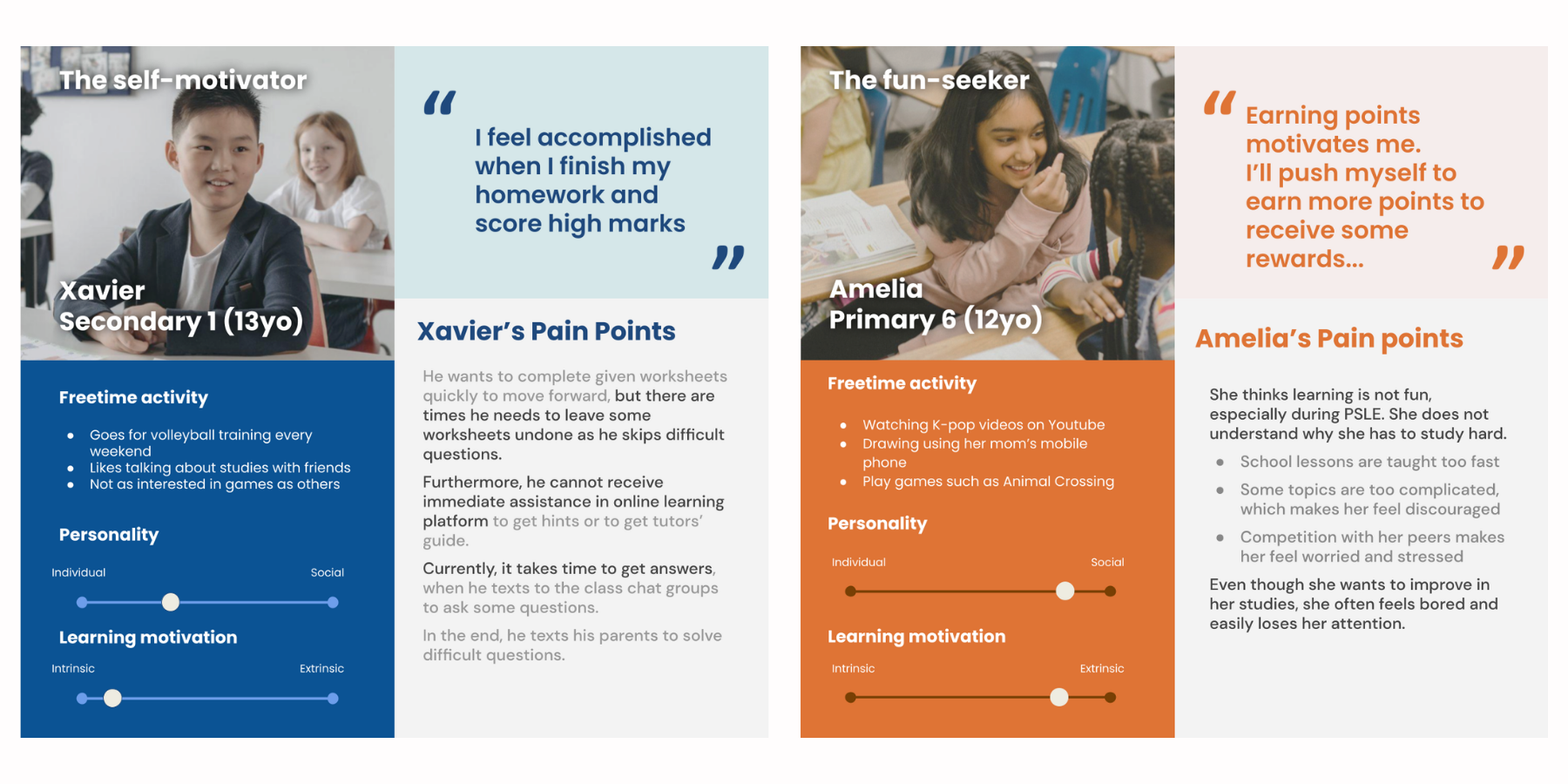
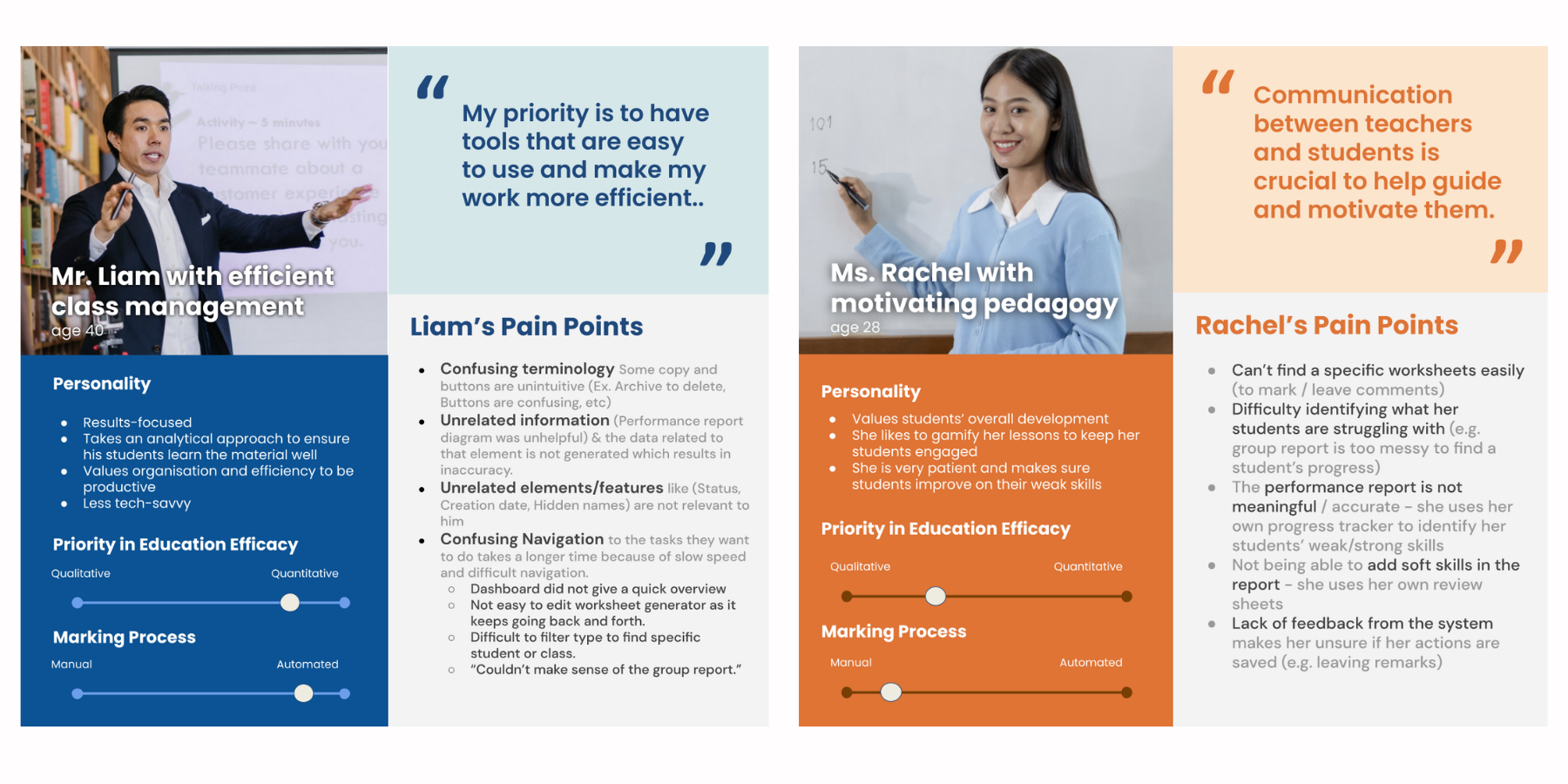
Key deliverables: we crafted students' and tutors’ persona cards to visualise SmartJen’s users to explain their pain points, needs and goals.
User experience (6 weeks)
With the insights gathered from the user research phase, we better understood tutors’ and students’ behaviors, challenges and needs and were able to make changes to the platform for optimal user experience in approximately six weeks.
We created revised user flows to provide more simplicity and user-friendliness in the processes. We made sure that all these flows provided a consistent experience since some were linked to the student platform and vice versa.
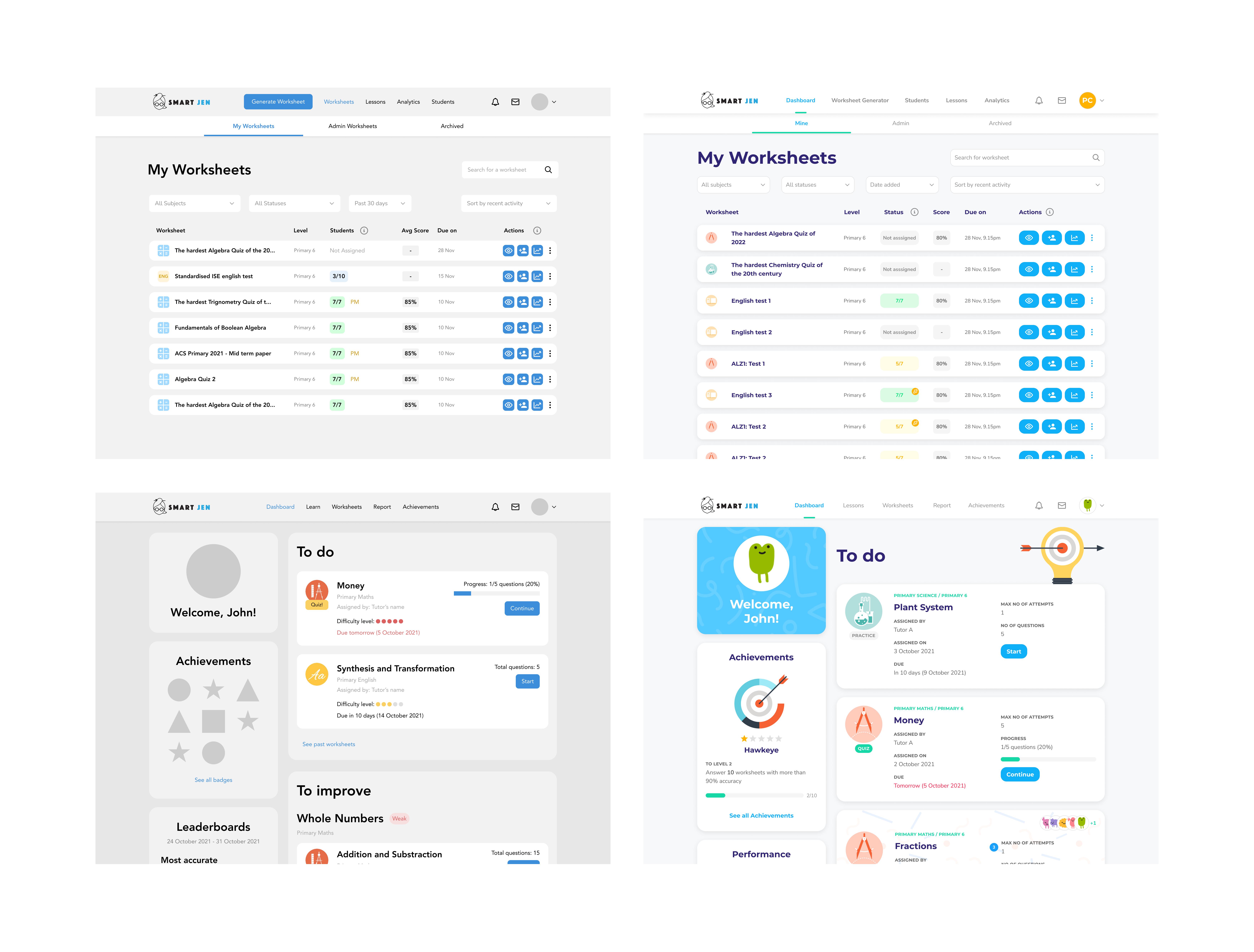
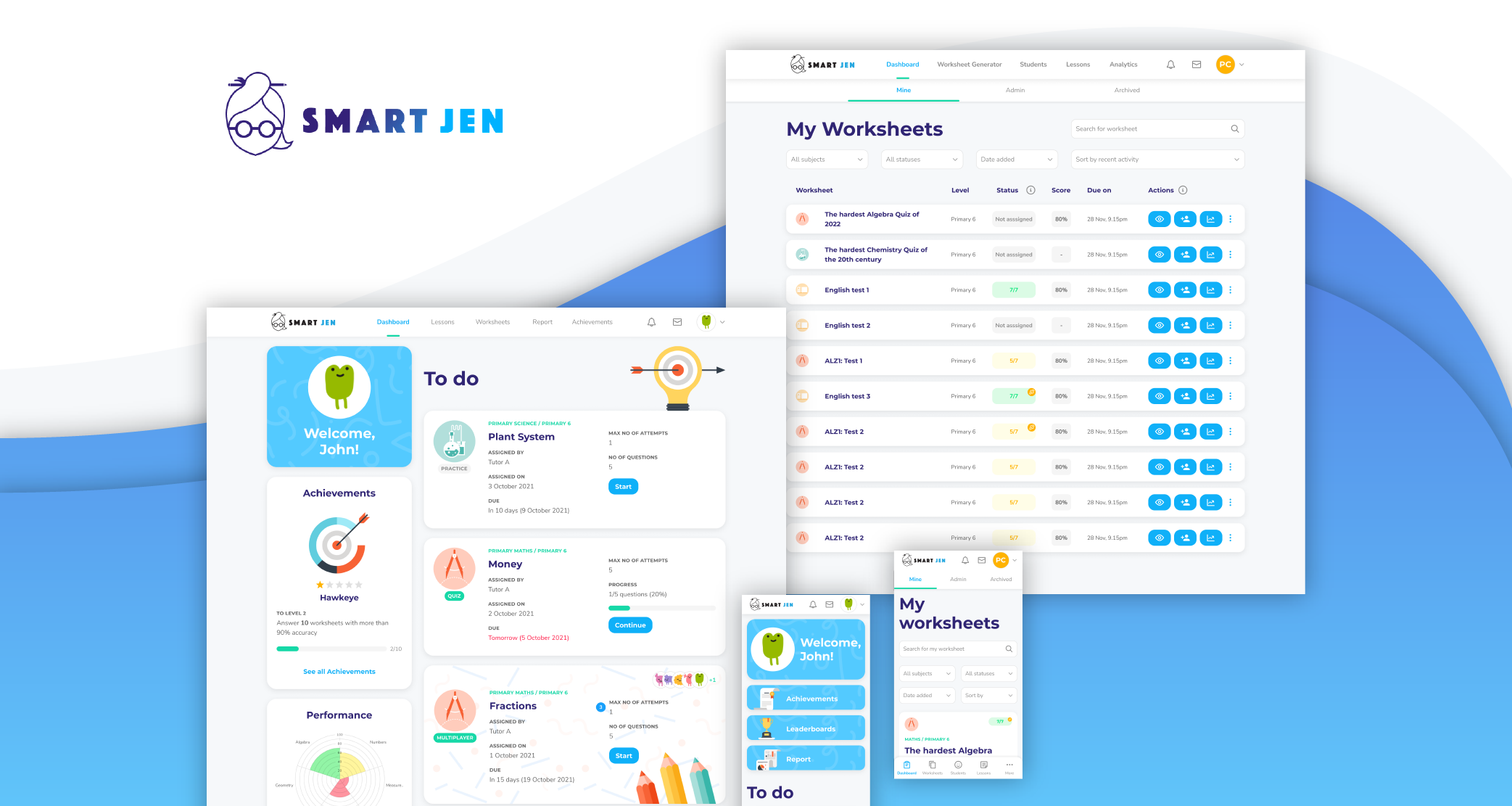
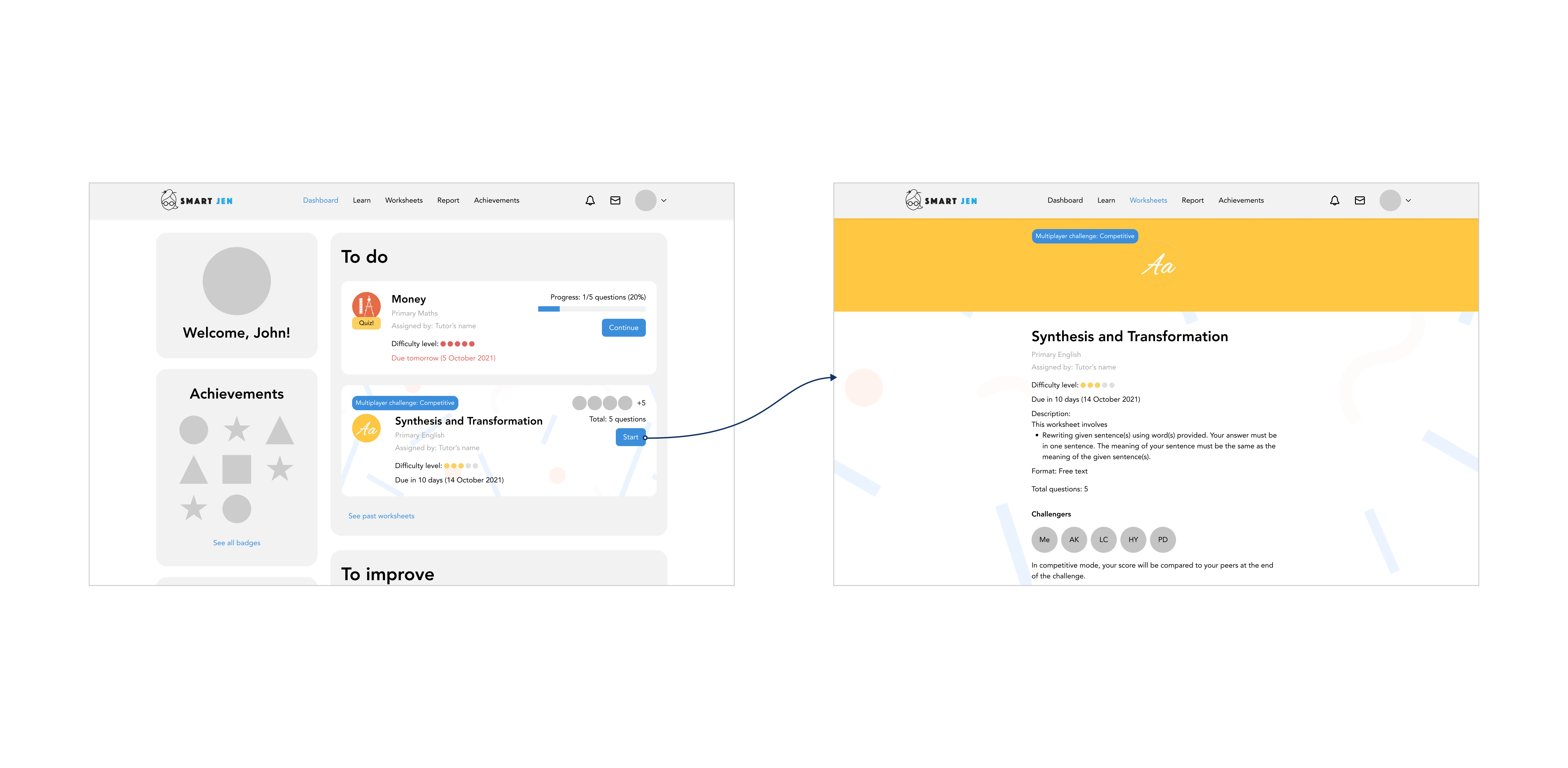
Students: To make students’ experience more fun, motivating and rewarding, we introduced gamification elements such as competitions, progression systems, and achievements. We also redesigned the dashboard to clearly indicate what had been assigned to them and what areas for improvement they could work on to help students understand their learning progress better.
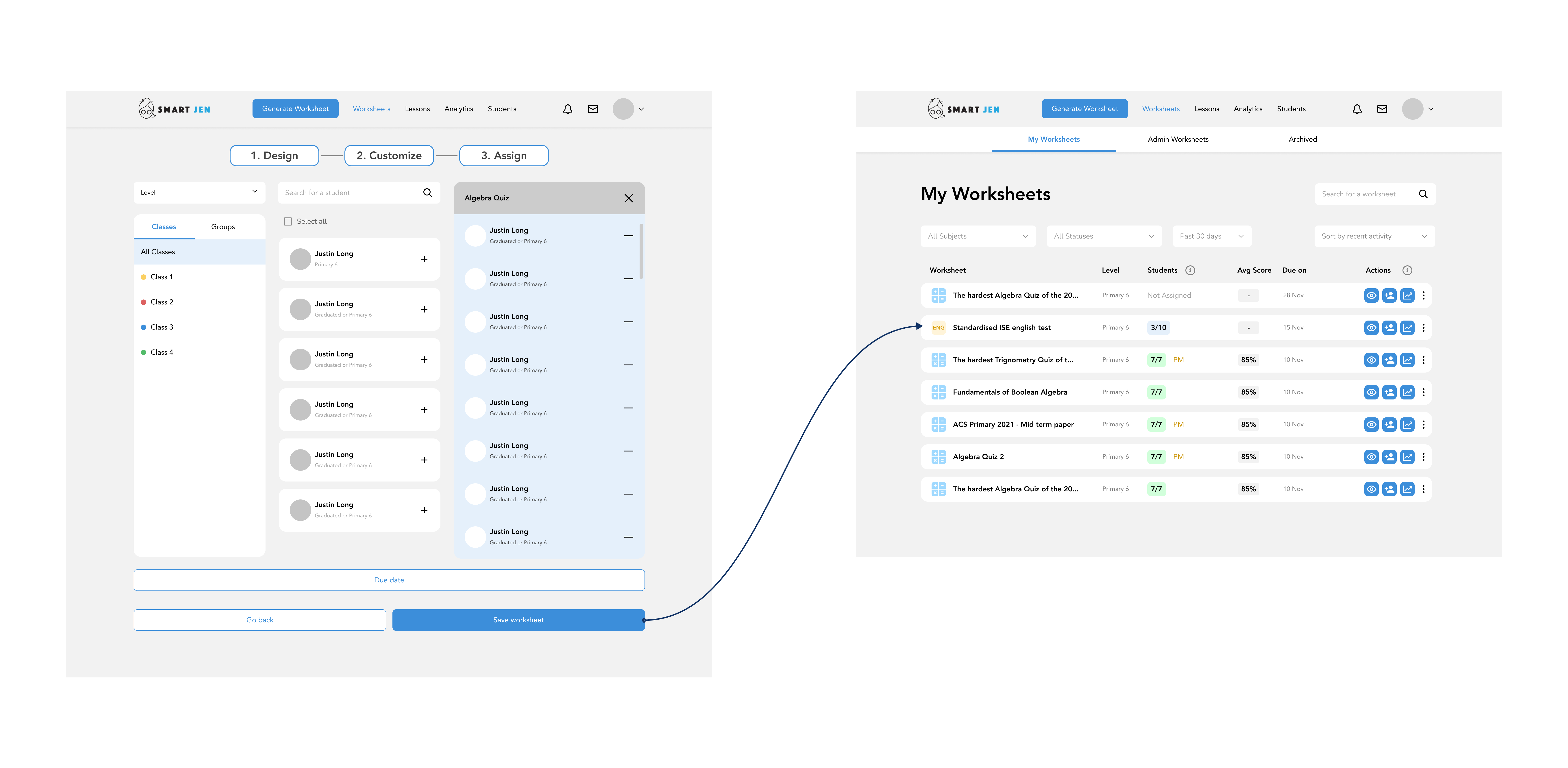
Tutors: To address the lack of clarity around the many features present on the platform, we modified the experience to make it easier to work on their primary tasks. Since generating worksheets and accessing the dashboard are integral features, we ensured these features were easy to access and navigate to.
User interface (6 weeks)
After the all-clear for the user flows, we moved on to creating the final user interactions, which generally falls after building a basic skeleton of a design. It is working on top of basic wireframes to provide final interfaces to develop by focusing on maximising usability and user experience.
We layed out the user architecture to understand the current flow structure and how to restructure some user flows in a way that would provide a better, more efficient user experience. Since the user architecture of these platforms was quite huge and complex, we had a single design system for both the student and tutor platforms. Though there were a few differences between the two, the design system acts as storage for all design and elements (parts of the platform) for the client and developers to view and acts as a set of guidelines on how to provide a consistent and scalable experience.
Our approach for the design system was based on the atomic design system created by Brad Frost whereby design systems are based on order and hierarchy. These elements were designed to make sure they could be plugged and played into the user interface screens so that the system was equipped to handle the scalability by increasing its adaptability to new features. This helped us keep the system as clean and minimal as possible and replicate similar experiences for the mobile version.
We also introduced suitable gestures and visual designs that would add value to the whole experience by being easy to interact with. With the final UI, we created a holistic experience for both the tutors and students and give them a better SmartJen experience.
