Client work
What Happens When a Digital UX/UI Designer Has to Design Something Physical
Adeline Kuswanto
10 mins read
Share this:

For the past decade, I've been a UX/UI designer working mostly on digital products - apps, websites, the kind of tools people use on their phones and laptops. Most of my work comes down to one thing: making experiences simpler and less frustrating.
For digital products, when something doesn't work, the consequences are manageable. Users drop off, conversion dips, you push an update and iterate. It could be annoying, but fixable.
That changed when 55 Minutes partnered with Salvage Garden on our Inclusive Inquiry initiative, where we asked communities and organisations for their real problem statement around accessibility so we could try to solve them. One submission came from a Salvage Garden volunteer whose mother is a stroke survivor. He'd been trying to crack the same problem for months: In case of rain, how can a caregiver of a wheelchair user keep them dry in the rain when holding an umbrella and maneuvering the wheelchair at the same time?
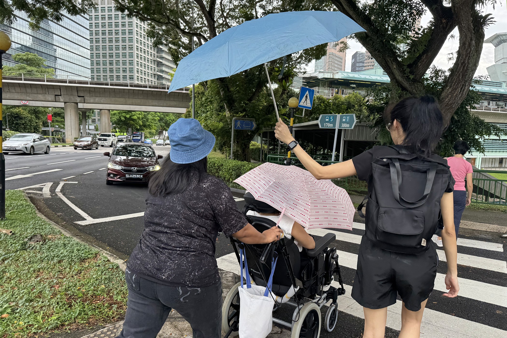
It takes two people and two umbrellas to keep one wheelchair user dry in the rain, and that's on a relatively clear day
It got me thinking about how different the stakes are when you move from digital to physical, especially when you're designing for people with disabilities. A poor experience isn't just annoying - it can mean real harm: injury, extra burden on caregivers, or quietly chipping away at someone's independence and dignity.
Here's what I learned from prototyping two products, a wheelchair canopy and a wheelchair raincoat, during the design and development phase of our wheelchair weather solution.
Lesson 1: Define the problem before you design the solution, but be agile enough to adjust when faced with new insights
We started with desktop research, visiting hospitals, speaking with wheelchair manufacturers and caregivers whose family members had experienced strokes.
We learned pretty quickly that we'd been thinking about the problem too narrowly. We'd gone in assuming a rain solution was primarily about keeping the user dry. But caregivers told us about the travails of pushing someone through the rain: navigating bumpy pavements, making sure umbrellas don't poke other pedestrians' eyes, and how anything that takes more than fifteen seconds to attach was, for a tired caregiver, effectively useless.
We also learned that safety wasn't just one item on a list, it was the filter that everything else passed through first. Anything that felt even slightly risky - something catching in the wheel, a material that flaps in the wind, or anything that obstructed the user's vision - was simply off the table.
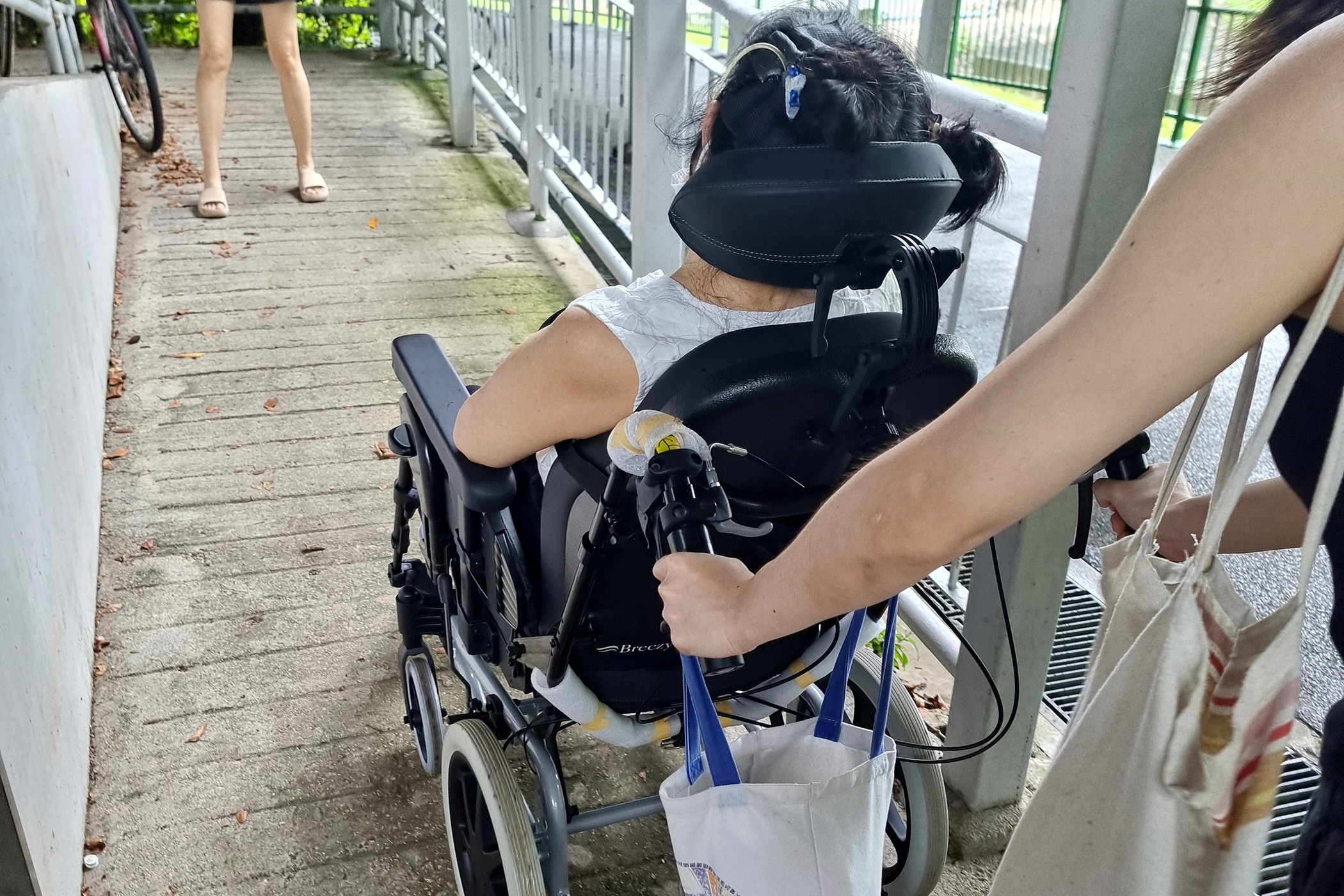
Navigating slopes while pushing a wheelchair already takes both hands. Adding an umbrella to the mix makes it even harder
Lesson 2: Meeting your design criteria will require more time and effort that you anticipate - prepare for it
With a clearer picture of the problem, we worked with Salvage Garden and two recruited volunteers to define and prioritise six design criteria. The solution needed to be safe, easy to use (to put on and take off), adaptive to different wheelchair users and sizes, offer high coverage, be affordable, and be accessible.
In digital design, I could tweak a design on Figma to check off all six criteria in an afternoon. In physical design, each one was its own puzzle that took days of effort to piece together. Whenever we thought we'd solved one, it often scrambled another and sent us back to square one. It was a much more humbling process than we had expected.
Lesson 3: The Designer is the Facilitator, people you’re designing for are the experts
One thing I feel strongly about is that the best outcomes come from designing with people rather than for them, and this project really put that to the test. Our co-creation sessions with caregivers weren't just a research formality. The people in those rooms, who knew firsthand what it meant to navigate daily life alongside a wheelchair user, shaped the solution more than any of our internal brainstorming did. Our job as designers was really just to create the conditions for the right ideas to come out, which meant listening a lot more than talking and being genuinely open to having our assumptions overturned. We weren't the experts in the room, and the better ideas often came from the caregivers we were working with.
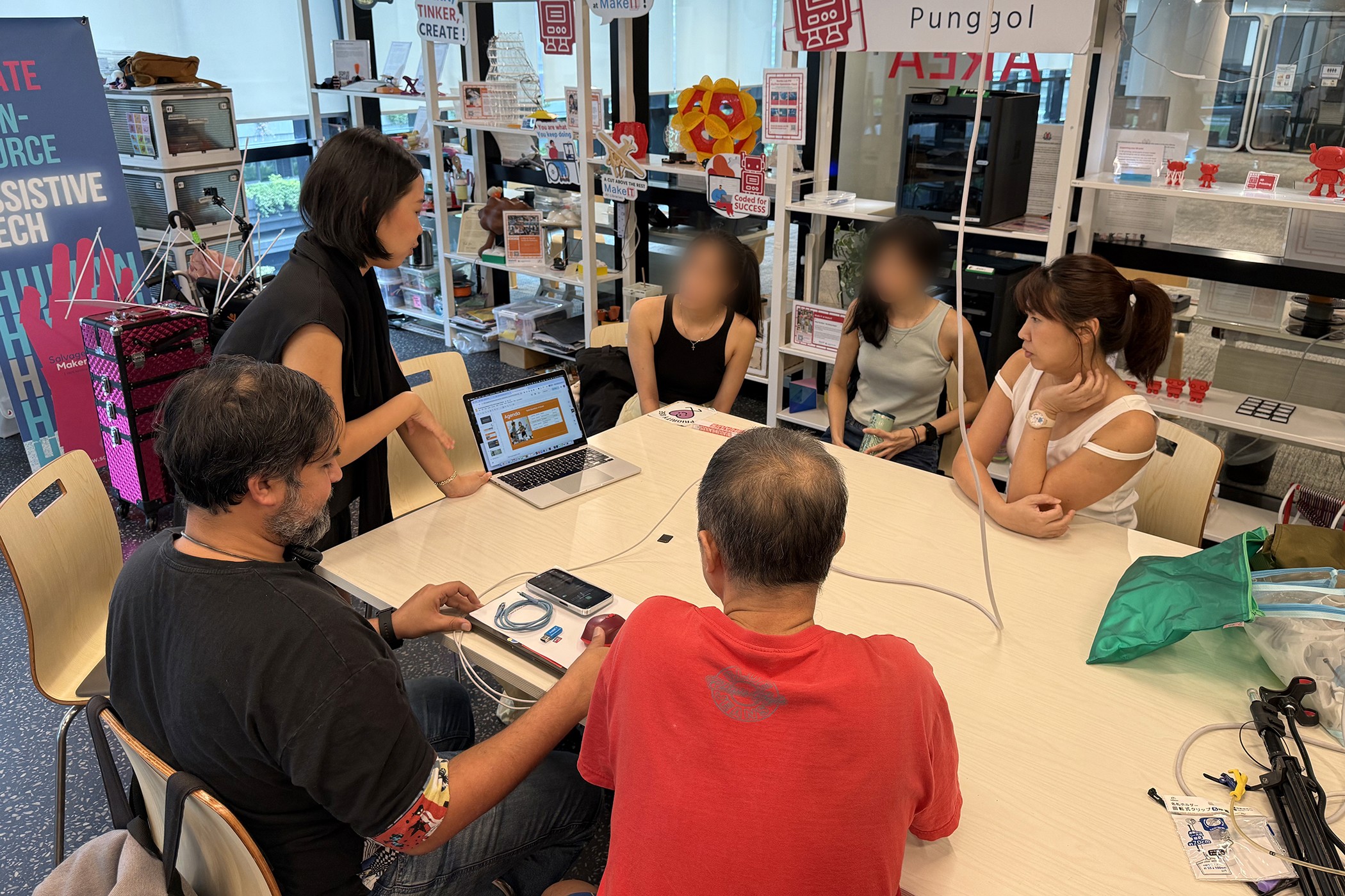
One of our co-creation sessions with caregivers, where their firsthand experience shaped the direction of our design
Lesson 4: Embrace low-fidelity prototyping
In digital design, we typically wireframe and sketch before we build anything, because moving fast in low fidelity is how you catch bad ideas early before you've invested too much time into them. The physical equivalent is cardboard, tape, and whatever you can find lying around a workshop.
In our early sessions, we were cutting shapes from plastic and paper and draping them over wheelchair frames to understand proportions, figuring out how a canopy might attach, how a raincoat needed to fold, where stress points would appear. They looked a bit ridiculous, but that's the point. Like a rough wireframe, a cardboard prototype isn't meant to look good. It's there to show you what works and what doesn't, and the feedback is immediate in a way that digital prototyping often isn't. You can feel when something is awkward to attach and see right away if the coverage falls short.
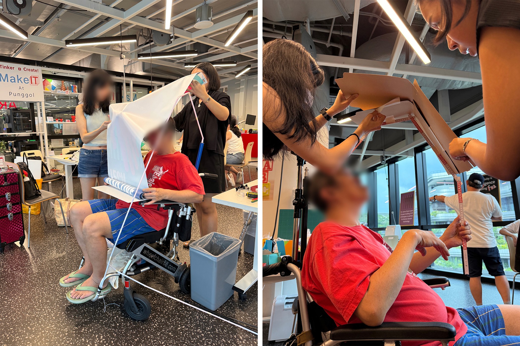
One of our first canopy prototypes, held together with paper and plastic straws, being tested for size and coverage on a real wheelchair
Lesson 5: Test, test, test and be comfortable with redoing everything
In design practice, it's easy to fall in love with a direction and find reasons to keep nudging it forward rather than stepping back and rethinking it. Physical product design has a way of not letting you get away with that.
We went through multiple rounds of completely rethinking our approach. A canopy attachment mechanism that seemed to make sense on paper turned out to be really hard to install with one hand. A fabric we liked for its weight and waterproofness trapped moisture underneath. Each time, we went back to the drawing board and asked honestly: does this actually meet the criteria we've set? When the answer was no, we started over.
In digital design, something imperfect can still go out the door and be fixed in the next update, but in physical design that's rarely an option. Each failed prototype taught us something that made the next attempt better, and the hardest part was resisting the temptation to convince ourselves something was good enough when it wasn't.
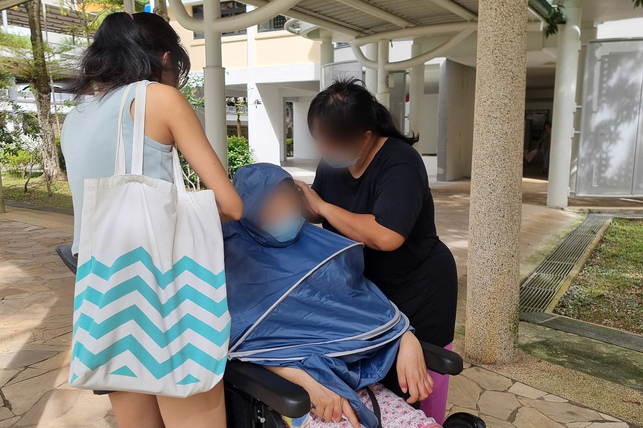
Testing a higher-fidelity raincoat prototype with a real user and her caregiver, to see how easy it is to put on and adjust
Lesson 6: The environment is a constraint you often can't control
In digital design, most of our constraints are predictable: screen size, load time, browser compatibility. Physical design works differently because the real world isn't something you can fully anticipate or negotiate with. A rain canopy needs to work in wind, in a crowded hawker centre, on an uneven pavement kerb, used by someone who's tired or has limited grip strength, and often without a second pair of hands nearby. When something goes wrong in that context, the user feels the consequence immediately.
So rather than trying to eliminate uncertainty, the goal is really to design for it. Test in real contexts, bring in people with lived experience early, and build in enough adaptability and flexibility that the product can handle what you didn't anticipate.
Lesson 7: When designing for accessibility, your edge cases are likely your main use cases
In digital design, we tend to design for a fairly representative "average" user and leave edge cases for later. When you're designing for the disability community, you realise pretty quickly that this approach doesn't hold up.
We assumed our canopy had adequate clearance, until we thought about wheelchair lifts where even a modest overhang becomes a genuine problem. We hadn't thought much about caregiver height either, until we realised a canopy designed for a taller person could block the sightline of someone shorter. These weren't unusual scenarios, they were the everyday reality of a diverse group of users: different bodies, different environments, different daily routines. The wheelchair user who takes a lift every day or the caregiver who is 155cm tall aren't edge cases to solve later; they're people to design for from the very beginning.
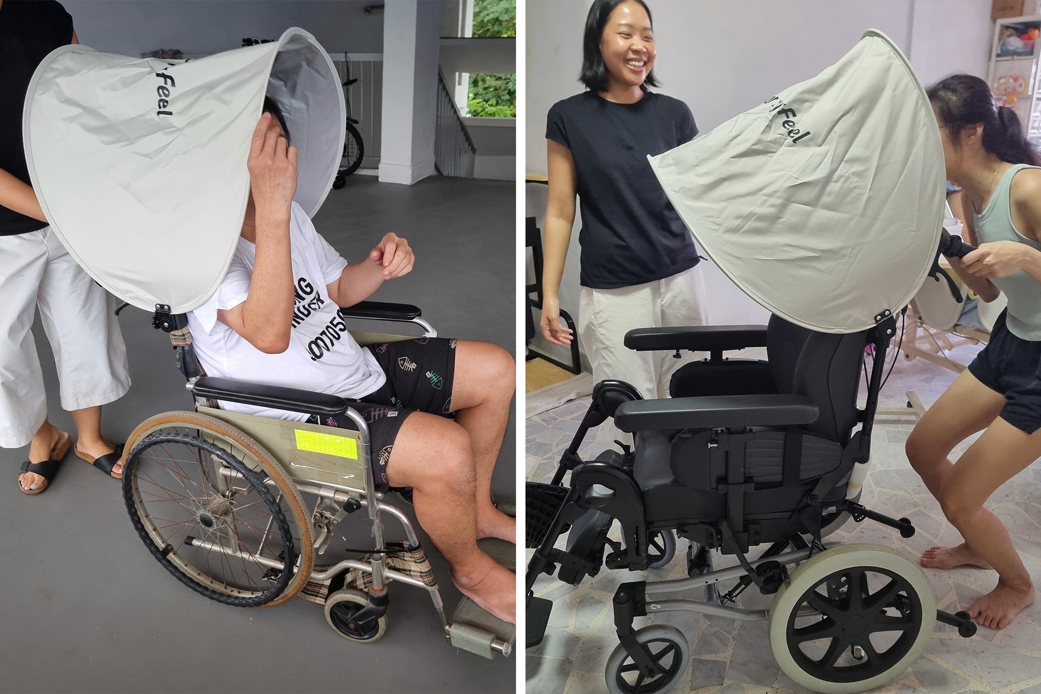
Checking how the canopy angle and coverage changes depending on the height of the person pushing the wheelchair, one of those details that only becomes obvious when you test it in person
What I Brought Back
I came into this project with a decade of digital design experience, and while that was genuinely useful, physical product design humbled me in ways I didn't see coming. The materials, the environment, the users, the caregivers - none of them behaved the way a screen does, and there was a lot of unlearning involved.
Designing for people with disabilities made all of this feel more important too. When a poor design decision affects someone's safety, independence, or dignity, the bar for what counts as "good enough" changes completely. You have to be willing to ask for help from the people who actually live this experience, to redo things as many times as it takes, and to sit with a lot of ideas that don't work before you find one that does.

A big thank you to our volunteers/caregivers who gave their time, shared their experiences, and helped shape every iteration of this project. The things they taught us about designing for real people in the real world will stay with us long after we're back behind a screen!
Curious about what we ended up creating? See the final product on our portfolio page.
Want to go deeper into the process and replicate the poncho on your own? Download our full report. If you want to know more about the co-creation process of this project, our designer Pradnya shared her thoughts in this blog post.
Do you
like
Share it with your friends!
https://55mins.com/blog/what-happens-when-a-digital-ux-ui-designer-has-to-design-something-physical
Copy link
Copied


