Team projects
Designing a Safe Space for Audio Journaling
How visual and interaction design can support emotional ease
Kay Thu
4 mins read
Share this:

We live in an age where most digital products are designed to grab and hold attention. The apps that ping you the second you look away. That constant tug can leave us overstimulated, even anxious. So when I began designing Polaraud.io, I wanted to explore the opposite: what would it mean to design for emotional ease rather than engagement?
Personally, I’m drawn to the idea of creating spaces that practice digital quiet. After years of feeling constantly distracted; from doom-scrolling, consuming and reacting, I’ve come to value moments that don’t shout for attention. Apps like Calm and BlankSpaces, which I return to from time to time, evoke that feeling for me. Exploring that balance feels like a way to bring calm back into our digital habits.
Polaraud.io takes a different approach. Instead of demanding attention, it creates space for it. Every design choice, from colour and typography to sound and interaction, was made to feel like a quiet exhale, a moment where users can pause, reflect, and feel safe sharing something personal.
A space to breath
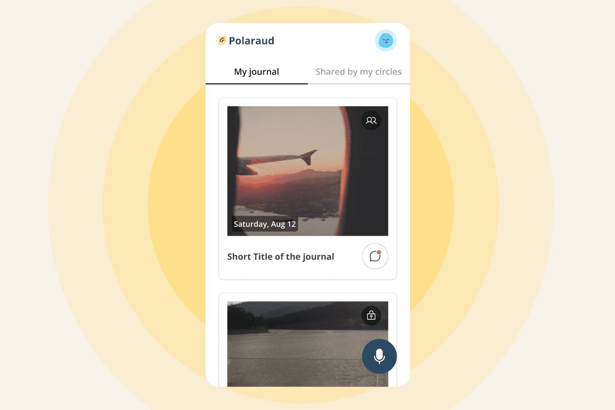
I wanted the interface to feel open. Generous white space and uncluttered layouts give it room to breathe. That openness isn’t just aesthetic; research has shown that uncluttered layouts reduce decision fatigue and support focus, crucial for reflective experiences.
When you open Polaraud, there’s just one clear place to begin. No flashing options, no pressure to do anything else. The spatial design follows a principle of progressive disclosure. Only what’s essential appears on the home screen: the record button, a gentle prompt, minimal navigation. Secondary functions like settings and history are tucked away but accessible. We wanted users to feel guided, not managed.
Warmth without overwhelm
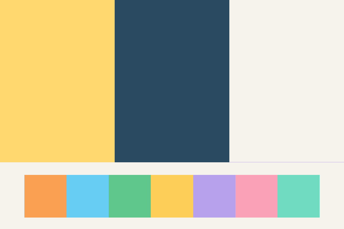
Choosing the colour palette was about finding warmth without noise. We mixed soft neutrals with gentle off-whites and muted beiges, coupled with a few vibrant accents. I remember testing different shades and realising how easily bright colours could tip from inviting to intrusive. So I leaned into lower-saturation hues that feel safe and steady. The balance is intentional: studies show that warm, low-saturation palettes can promote feelings of safety and calm, particularly in emotionally vulnerable contexts.
From the start, I prioritised contrast accessibility. Every colour combination meets WCAG AA standards for users with visual impairments. Appropriate color contrast can improve readability by as much as 40%, which in turn lowers user error rates, reduces eye strain, and increases user comfort.
Prioritising legibility
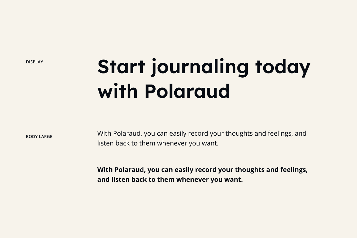
For typography, I selected Lexend for headings, a font explicitly designed to reduce visual stress and improve reading fluency and reduce cognitive load for all readers, including those with visual impairments. Its open forms, generous letter spacing, and minimal ornamentation help the eye glide without friction.
For body text, I opted for Open Sans, a humanist sans serif built for legibility across screens to go together with Lexend. Its neutrality and versatility allow it to recede into the background, letting users focus on content rather than decoding letterforms. Together, the two combinations create a hierarchy that guides without dictating, supports without overwhelming.
Quiet feedback loops
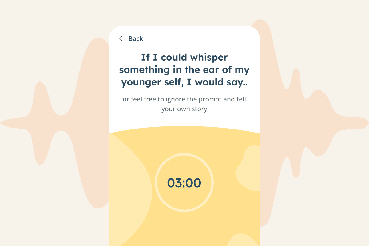
Interaction in Polaraud isn't about gamification, it's about reassurance.
Subtle audio cues signal state changes without distraction.A soft click accompanies the avatar blob selection, while a gentle, elevator-style ambient tone plays just before recording begins, giving users a brief moment to prepare. These sounds are intentionally calm and consistent, not celebratory or energetic, helping users feel centered and grounded in the moment.
Research shows that multisensory feedback increases user confidence and lowers perceived task effort, especially in reflective or creative applications.
By pairing visual transitions with gentle audio, Polaraud creates a cohesive sensory experience that feels complete without being overwhelming.
Design principles for emotionally safe interfaces
The design principles that shaped Polaraud - spacious layouts, accessible color systems, legible typography, thoughtful audio feedback - apply broadly to any product where users need to feel safe, focused, and in control.
Design decisions directly affect cognitive load. Colour choices can support or stress users. Typography can either facilitate or hinder comprehension. Audio feedback can reassure or irritate.
In a digital landscape increasingly optimised for engagement metrics, there's value in designing for something different: moments of genuine reflection and connection. Success doesn't always need to be measured in time spent or actions taken. Sometimes, it’s about how comfortable users feel simply being there.
Do you
like
Share it with your friends!
https://55mins.com/blog/designing-a-safe-space-for-audio-journaling
Copy link
Copied


