Branding
Design
Strengthening the brand of a comics publisher
Difference Engine
About client
Difference Engine is a Singapore-based independent comics publisher with a mission of publishing well-written, beautifully illustrated comics for a diverse audience.
Difference Engine is an independent comics publisher that’s inspired by stories from Asia, and committed to publishing diverse, well-written, and beautifully illustrated comics of all genres and for all ages.
Challenge
Difference Engine needed to set themselves apart from other comic publishing houses. Their brand identity at the time did not reflect their work and lacked the youthful, modern and vibrant look that they needed to attract potential young readers.
Solution
Give the existing brand a distinguishable, strong, and attractive brand personality aligned with who the company is as a publisher, and apply that consistently across their website for memorability
Results
A makeover to a distinct yet versatile corporate identity
The original logo was made up of two halves of a cog wheel which formed the letter D and E. Although well received, the logotype was difficult to read.
Since the client loved the look of the cogwheels, we simplified the shape of the cogwheels, reduced much of the detail, then designed a new small format where the cogwheels are stacked on top of each other to fit the narrow width of 15mm. We reconstructed the logo to be more symmetrical instead of having it rely heavily on optical alignment, another problem with the logo that frustrates the client.
The logo was then given new colours, navy and magenta, which brought about the boldness and energy that were missing from the original logo, The new handwritten typeface played up the playfulness that was needed to attract younger audiences.
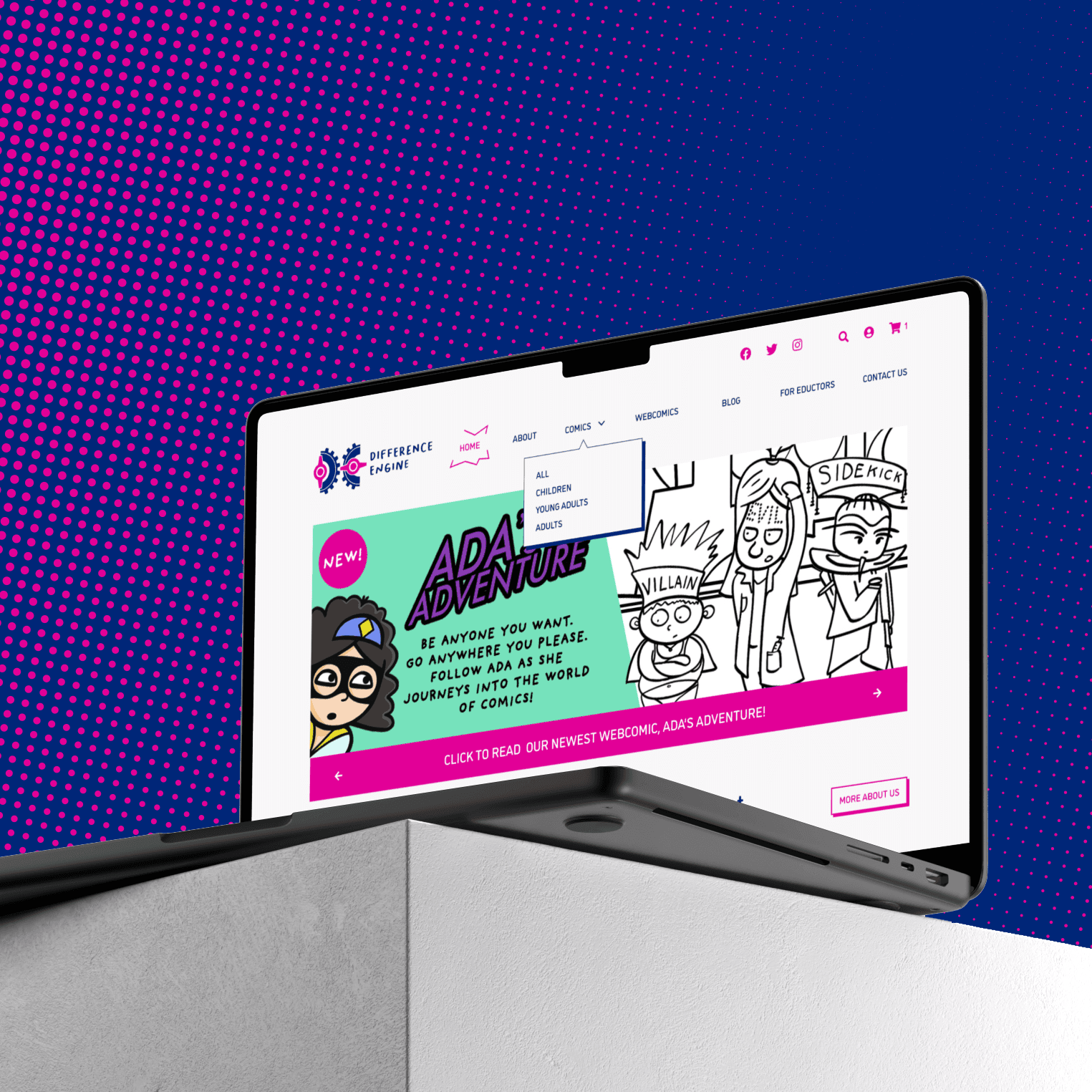
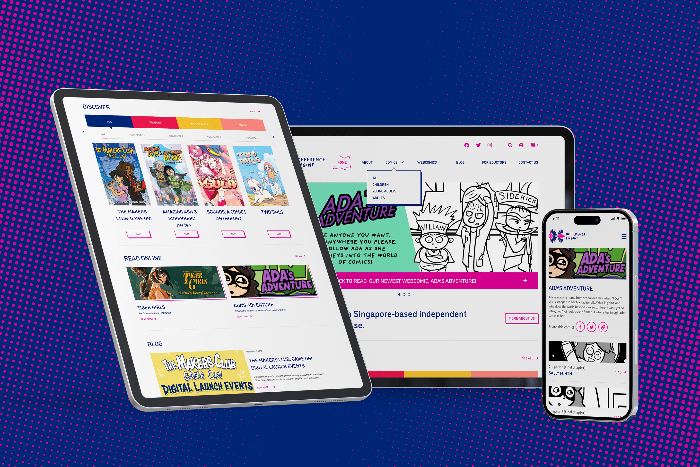
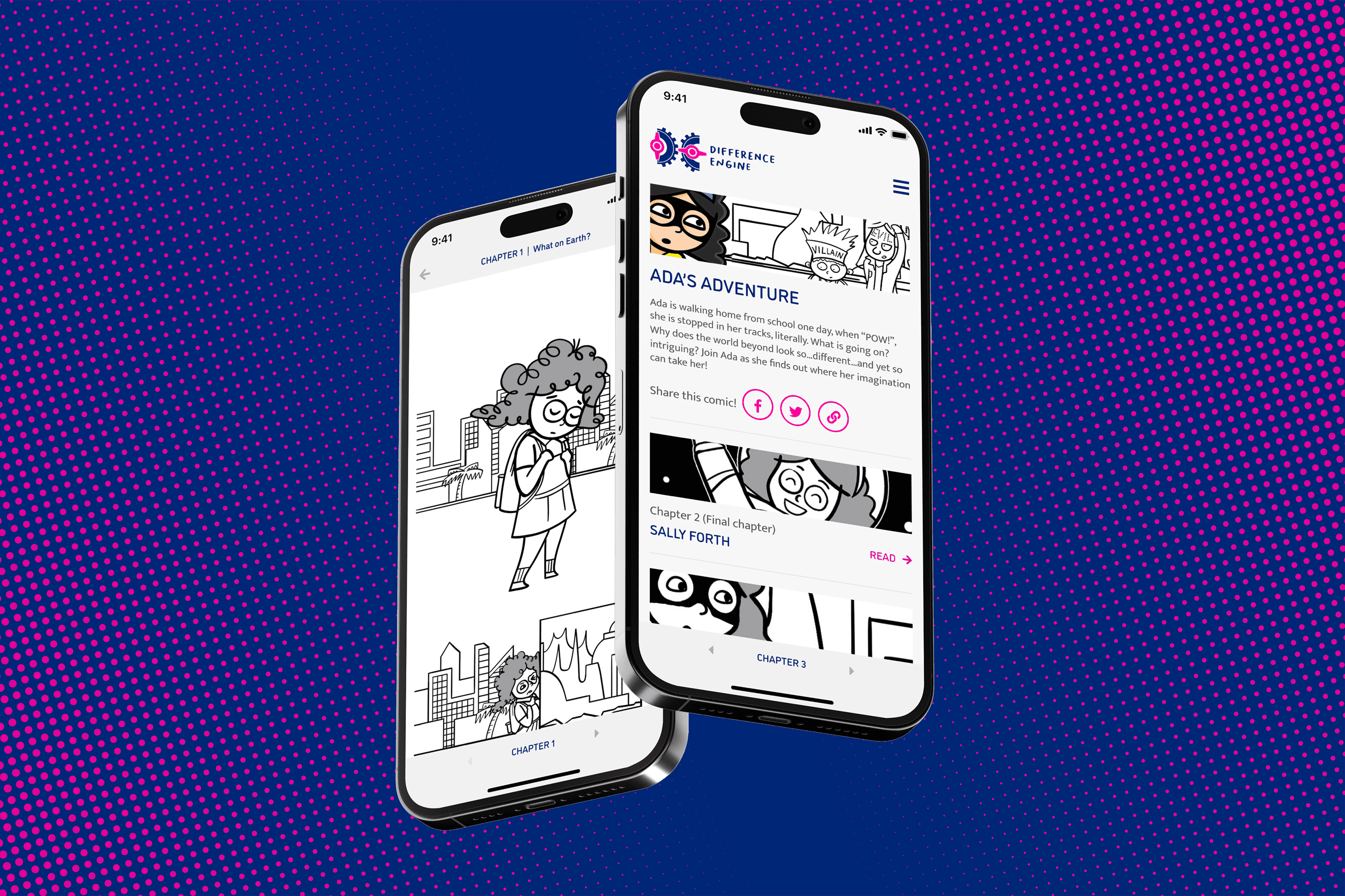
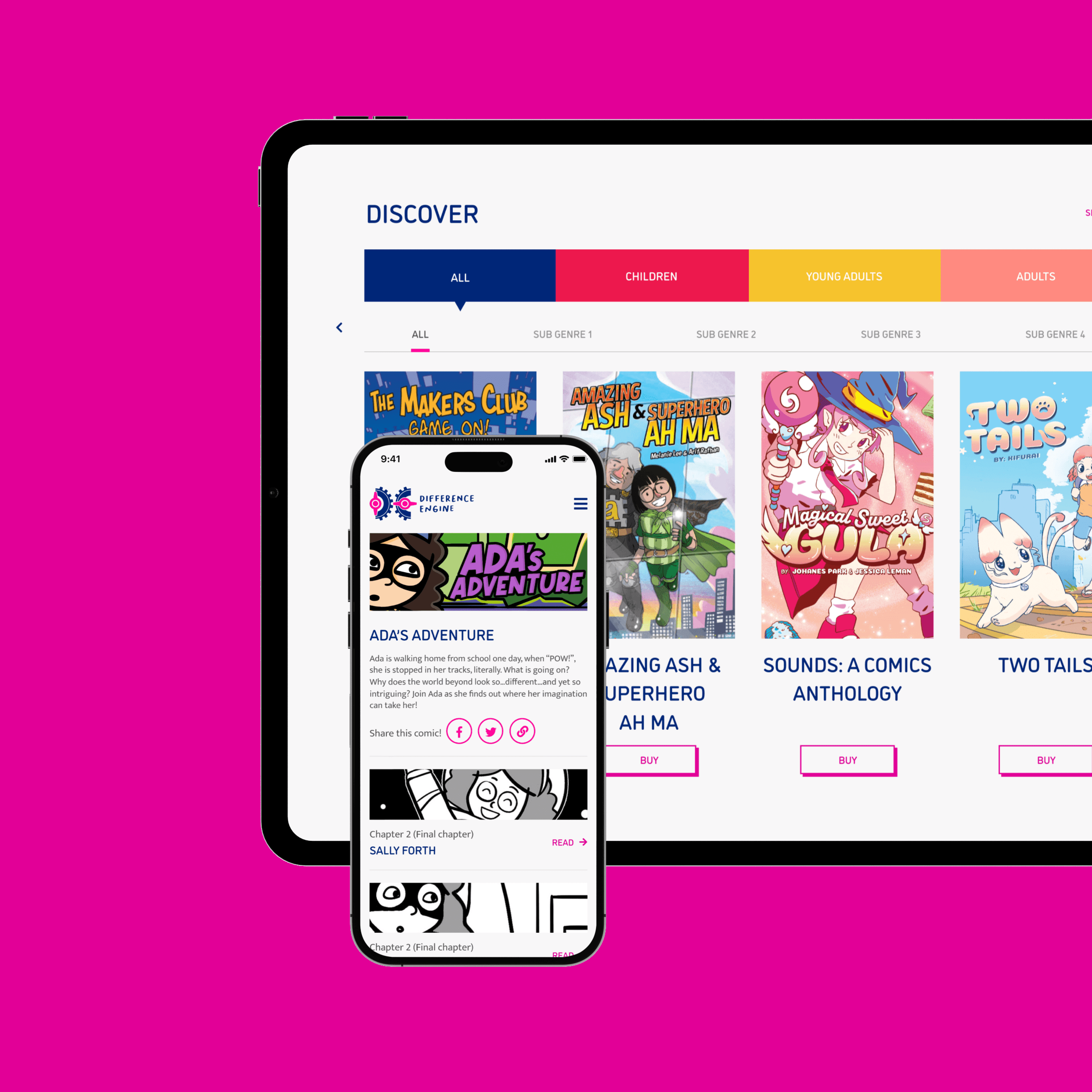
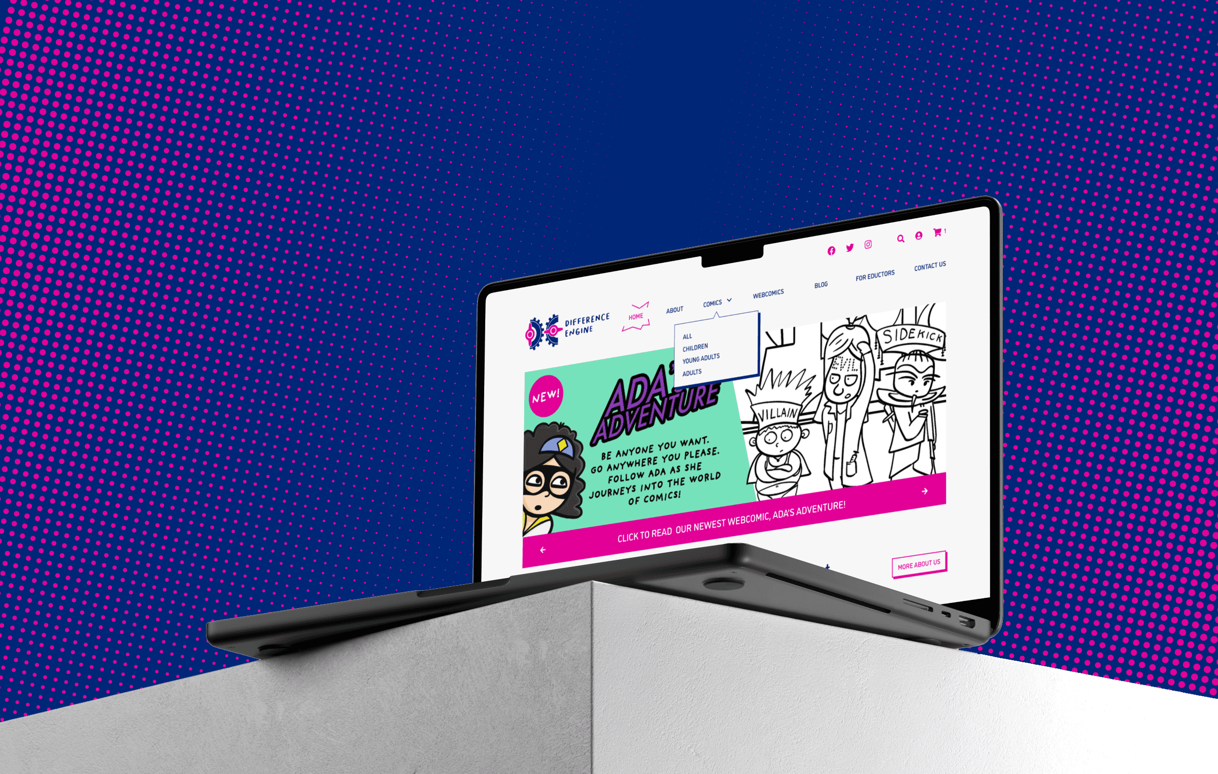
A responsive website design aligned with the new branding
Once the new brand identity was finalised, we updated Difference Engine’s website to conform to its new identity. We added a new comics section to highlight upcoming and existing comics available for purchase. We also integrated comics-inspired elements into the new UI design to emphasise Difference Engine’s nature and work as a comics publisher, adding a layer of fun to an otherwise generic website.
For Difference Engine’s new e-commerce page, we came up with a user payment flow which closely follows Difference Engine’s choice of e-commerce platform, Woo Commerce.
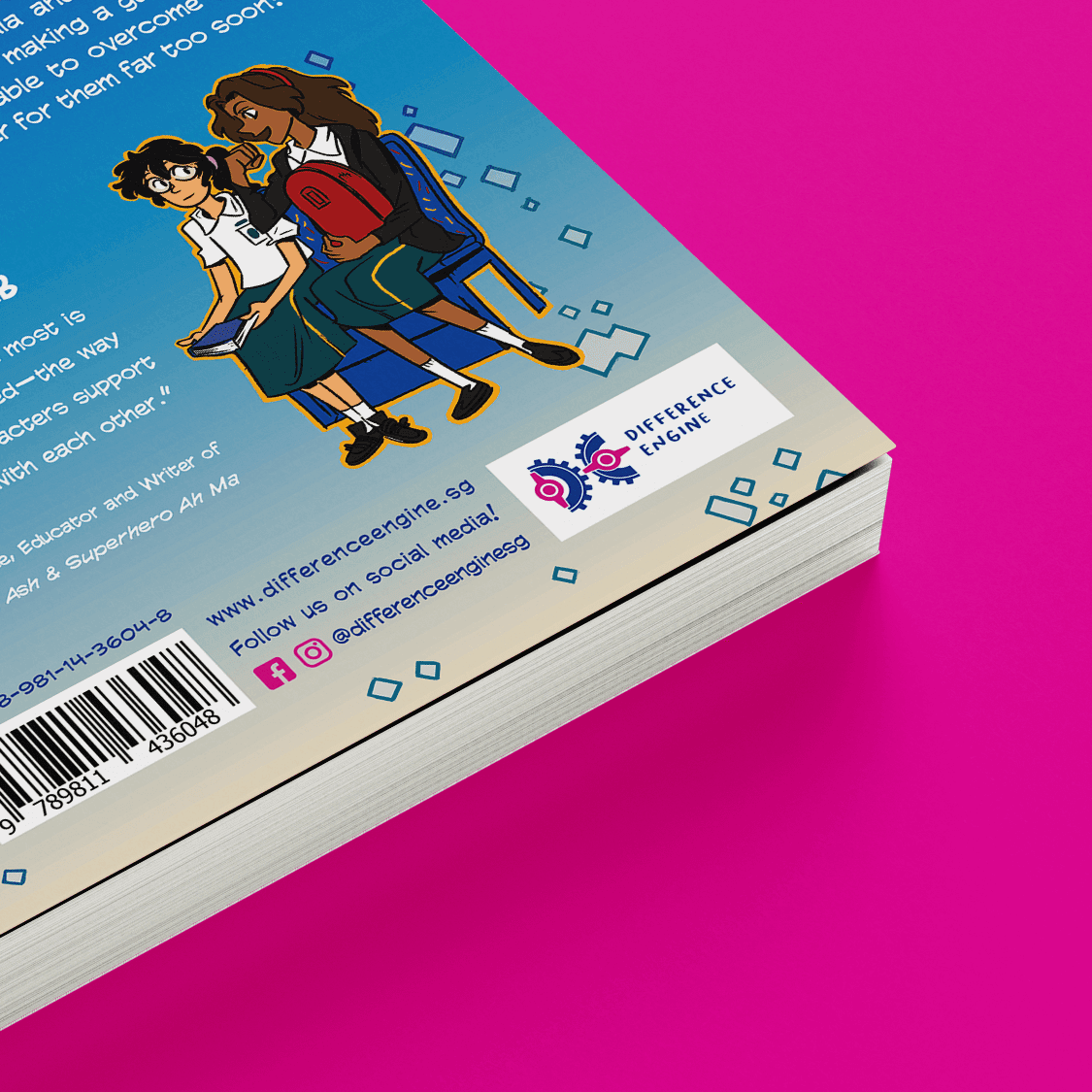
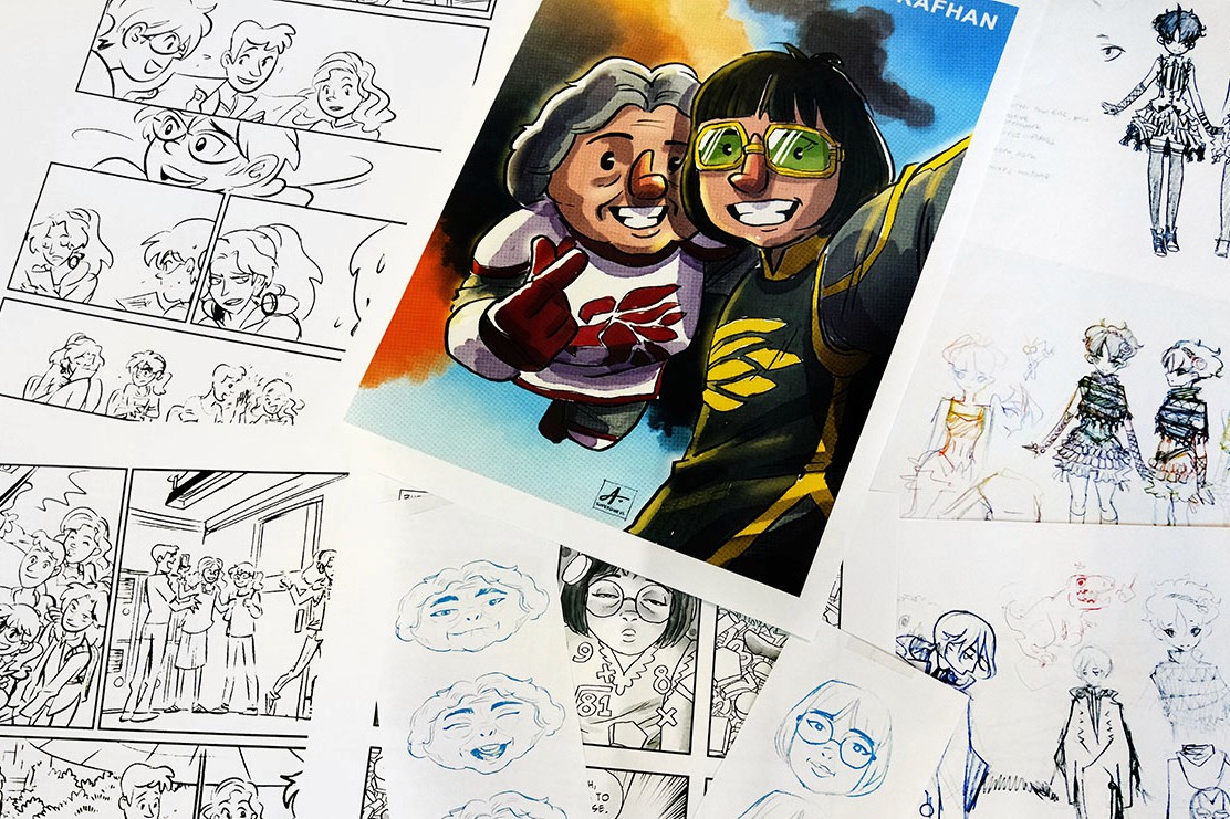
The rebranding exercise created a stronger and more consistent brand image for Difference Engine. Today the Difference Engine logo can be seen on the various comic books that they’ve released as well.
“55 Minutes worked with us on crafting a website interface for desktop and mobile that made browsing user-friendly and efficient, yet retaining the quirkiness that our brand required. From colour scheme to logo design, the team actively listened to our brief and assisted us in formulating a brand personality that reflected who we are as a new independent comics publisher in Southeast Asia.”

Felicia Low-Jimenez, Co-Founder, Difference Engine

